• NEW! LOWEST RATES EVER -- SUPPORT THE SHOW AND ENJOY THE VERY BEST PREMIUM PARACAST EXPERIENCE! Welcome to The Paracast+, eight years young! For a low subscription fee, you can download the ad-free version of The Paracast and the exclusive, member-only, After The Paracast bonus podcast, featuring color commentary, exclusive interviews, the continuation of interviews that began on the main episode of The Paracast. We also offer lifetime memberships! Flash! Take advantage of our lowest rates ever! Act now! It's easier than ever to susbcribe! You can sign up right here!

    Subscribe to The Paracast Newsletter!

How Silly is Climate Change Denial?

When someone makes their own journal to publish their material like Melba Ketchem did for the Bigfoot DNA findings isn't that the first indication of someone who is either trying too hard or is making stuff up?

& Pixel- are you really still busy just baiting people instead of arguing facts when you find them? The more you try to hold up others as somehow champions of your opposition the more it looks you're also trying too hard. I have no champions in this discussion. But I do think championing the false gods that confirm your vision might be a comfy bean bag chair to sit in, but it's still full of beans. Maybe they're magic? I bet if you plant one you'll be able to climb up to the upper atmosphere to see what's really going on up there. Let me know what you find when you get there.


Aye just some 5 guys messin about in their garage, just makin some shit n stuff up..


In the mid-2000s, a number of researchers claimed that man-made global warming was leading to an increase in the frequency and intensity of hurricanes, typhoons and other tropical storms. These claims seemed to agree with observations that the cost of damages from tropical storms had been dramatically increasing over the years. In 2005, when Hurricane Katrina devastated the city of New Orleans (USA), this was conclusive proof for many people.

As a result, it is now widely believed that global warming is causing an unusual increase in tropical cyclone activity. Now, it seems that whenever a heavy tropical storm makes landfall (e.g., 2012’s Hurricane Sandy or 2013’s Typhoon Haiyan), it is routinely assumed to be somehow related to our fossil fuel usage.

However, in this essay, we will show how this belief is seriously flawed for several reasons:

  • It is true that the devastation caused by hurricanes, typhoons and other tropical storms has been dramatically increasing. However, this is because the number of people living in at-risk coastal areas has substantially increased, as has the value of property and infrastructure in those regions.
  • There has indeed been a general increase in the number of recorded tropical cyclones, but much of this increase is due to improvements in our ability to detect cyclones through the use of satellites, aircraft surveillance and better computer analysis
  • Coincidentally, the 1970s seem to have been a relatively quiet era for tropical cyclones, while the 1995-2005 period was relatively active. So, in the mid-2000s, it seemed that there had been a continuous trend from the 1970s. However, 2005 seems to have marked the peak in that active era, and tropical cyclone activity seems to have gone relatively quiet since then.
  • More recent studies have suggested that the proposed link between global warming and cyclone activity is not as straightforward as had been originally thought.
The tragedies of recent tropical cyclones such as Hurricane Katrina (2005), Cyclone Nargis (2008), Hurricane Sandy (2012) and Typhoon Haiyan (2013) are bitter reminders of how we should be actively working to improve our ability to adapt and respond to tropical storms. We should also continue researching into better hurricane monitoring and prediction. But, this should be done regardless of global warming.


1. Introduction
In this essay we will address the popular claim that man-made global warming is leading to more frequent, and more powerful tropical cyclones, e.g., hurricanes, typhoons and other heavy tropical storms. We will show that this claim is invalid, and is based on an incomplete, and inadequate analysis of the data.

Before we do so, it may be helpful to briefly summarise some of the basic facts and figures on tropical storms.


Figure 1. Storm tracks of all recorded tropical cyclones up to 2006. Adapted from a figure in Trenberth, 2007 (Abstract; Google Scholar access). Click on image to enlarge.

Every year, during the summer/autumn, about 80-90 tropical storms form over the oceans. About 40-50 of these become strong enough to be classed as “tropical cyclones”. Depending on where a tropical cyclone forms, it can have a different name. Tropical cyclones which form in the North Atlantic or east Pacific oceans are known as “hurricanes”. If they form in the west Pacific, they are known as “typhoons”, while if they form in one of the other ocean basins, they are known as “cyclones” – see Figure 1.
Most of these tropical cyclones die out while they’re still out at sea, but maybe 10-20 of them will strike land.

To distinguish between different strengths of tropical cyclones, meteorologists usually use the “Saffir-Simpson hurricane scale”, even though this scale was originally just devised for describing “hurricanes”. In the Saffir-Simpson scale, cyclones are classified based on their maximum sustained wind speeds, as follows:

  • “Tropical depression” = wind speeds less than 17 m/s (38 mph or 62 km/h)
  • “Tropical storm” = wind speeds less than 32 m/s (73 mph or 118 km/h)
  • Category 1 = wind speeds less than 42 m/s (95 mph or 153 km/h)
  • Category 2 = wind speeds less than 49 m/s (110 mph or 177 km/h)
  • Category 3 = wind speeds less than 58 m/s (129 mph or 208 km/h)
  • Category 4 = wind speeds less than 70 m/s (157 mph or 251 km/h)
  • Category 5 = wind speeds of at least 70 m/s (157 mph or 251 km/h)
When a tropical cyclone strikes land, its effects can be devastating for those who live in (or near) its path. There are three features of a tropical cyclone which are particularly devastating:

  1. Very high wind speeds
  2. Storm surges
  3. Heavy rainfall and thunderstorms

Figure 2. Damage caused to a house in Brooklyn, NY (USA) by Hurricane Sandy in 2012. Taken from Wikimedia Commons. Click to enlarge.

For this reason, when a major cyclone makes landfall, its effects are often disastrous, and it is global news. However, in recent years, a popular perception seems to have arisen that man-made global warming is causing more frequent and more intense cyclones to occur. As a result, nowadays, whenever a cyclone makes landfall, people have taken to blaming it on our fossil fuel usage.
For instance, after storm surges from Hurricane Sandy caused extensive damage to New York City, NY (USA) in October 2012, it convinced the Mayor of New York City, Mike Bloomberg that man-made global warming is real and that we should immediately reduce our carbon dioxide emissions:

Our climate is changing. And while the increase in extreme weather we have experienced in New York City and around the world may or may not be the result of it, the risk that it might be — given this week’s devastation — should compel all elected leaders to take immediate action. - Mike Bloomberg, 1st November 2012

As another example, U.K. Prime Minister, David Cameron, has claimed that the November 2013 Typhoon Haiyan, which caused catastrophic destruction to the central Philippines was related to man-made global warming:

There is growing evidence that climate change is linked to severe weather events such as the typhoon in the Philippines - David Cameron, 16th November 2013

Although the devastation Typhoon Haiyan caused in the Philippines was horrendous, there does not appear to have been any long term trend in the number of tropical cyclones reaching the Philippines, e.g., see Kubota & Chan, 2009 (Abstract; Google Scholar access). Some of the initial media reports and blog commentary of Typhoon Haiyan suggested that it was “…an unnaturally powerful storm… [which]…exhibited characteristics outside the range of natural variation.” and that it was so strong we might need a new hurricane category. However, this seems to have been just sensationalism and over-hype – the typhoon seems to have been a very strong storm, but was definitely not the strongest, e.g., see here, here, or here.

So, why do so many people believe that humans are causing an increase in cyclone activity, and that our fossil fuel usage is somehow to blame for these natural disasters?

In Section 2, we will discuss how the notion arose. Then in Sections 3-6, we will show how it is an invalid notion, which is based on an incomplete and inadequate analysis of the data.


2. The 2005 “hurricane wars” debate
A. The proposed link between global warming and tropical cyclones
Tropical cyclones are known to form over warm ocean waters, with Sea Surface Temperatures (SST) generally being at least 26°C (80°F) before they form, e.g., see here.

This apparent link has led some researchers to propose that the intensity of a tropical cyclone depends on the temperature of the oceans over which it forms. According to this theory, if the tropical oceans heat up, this should mean more frequent and more intense tropical cyclones. The corollary of the theory is that if the tropical oceans cool down that would mean a reduction in cyclonic activity.

It is important to stress that this is only a theory, and despite on-going research, we still don’t know exactly how and why tropical cyclones form and what decides their intensity – the technical term for this subject is “tropical cyclogenesis”. See Knutson et al., 2010 (Abstract; Google Scholar access) for a recent review.

Indeed, in one of our papers, we identify a new mechanism which suggests that the main driver in cyclone formation is a rapid change in the altitude at which “multimerization” occurs, and not the ocean temperatures – see this essay for more information on this.

Figure 3. Average Sea Surface Temperatures (SST) during the first week in December 2013. Downloaded from the NOAA/ESRL/PSD website. Click to enlarge.

Nonetheless, the theory that cyclone intensity is related to ocean temperatures is quite popular among the tropical cyclone scientific community.
If the theory is correct, and warmer ocean temperatures cause more intense and more frequent tropical cyclones, then global warming should cause an increase in cyclone activity.

B. The debate
In the 1990s, this theory was the subject of some debate, and there didn’t seem to be any conclusive evidence one way or the other. While computer models suggested that global warming should cause an increase in cyclone intensity, e.g., Evans et al., 1994 (Open access), the historical data showed no obvious link between the intensity of a tropical cyclone and the temperatures where it formed, e.g., Evans, 1993 (Open access).

This all changed in the mid-2000s, when several researchers began publishing papers claiming to have finally discovered evidence proving that man-made global warming was increasing the frequency and intensity of tropical cyclones, e.g., Trenberth, 2005 (Abstract; Google Scholar access); Emmanuel, 2005 (Abstract; Google Scholar access); Webster et al., 2005 (Abstract; Google Scholar access); Trenberth & Shea, 2006 (Abstract; Google Scholar access); Mann & Emanuel, 2006 (Abstract; Google Scholar access); or Holland & Webster, 2007 (Open access).

Coincidentally, 2004 and 2005 marked the peak of a very active period for tropical cyclones which had begun in the mid-1990s. When Hurricane Katrina devastated the U.S. city of New Orleans in August 2005, this was compelling confirmation for many people that we were seeing unusual changes in the weather, and that this was due to man-made global warming:

However, while a lot of researchers were convinced that they had found compelling evidence for a man-made global warming “signal” in the tropical cyclone trends, there were also a lot of researchers who strongly disagreed.

As a result, the claim that man-made global warming was causing an increase in hurricane activity was very controversial, and it led to a bitter divide amongst scientists studying cyclones. Two camps formed, with one arguing that the 1995-2005 period of high cyclone activity was just part of natural variability, and the other arguing that it was due to man-made global warming.

The controversy became quite vicious and personal, with both camps considering the other camp completely wrong. For example, see Pielke et al., 2005 (Open access), the response by Anthes et al., 2006 (Open access) and the reply by Pielke et al., 2006 (Open access)

Dr. Chris Landsea (a supporter of the natural variability explanation), even resigned in January 2005 as a contributing author to the Intergovernmental Panel on Climate Change (IPCC), after the co-ordinating lead author for his section, Dr. Kevin Trenberth (a supporter of the man-made global warming explanation) held a press conference, implying that the IPCC considered the high hurricane activity of 2004 to be related to man-made global warming.

The dispute came to a head when it made headlines in the Wall Street Journal on 2nd February 2006 (Paywall access; Alternative link on Post-Gazette.com). According to Prof. Judith Curry (a co-author of Webster et al., 2005), this prompted a truce between the two opposing camps – see here.

Since then, while debate continues between the two camps, it has been much more civil, with researchers on both sides conceding the data is problematic, and that it is probably too uncertain to establish conclusively whether the cyclonic activity of the 1990s and 2000s were unusual or not. See for example the recent Knutson et al., 2010 review (Abstract; Google Scholar access), which involved collaboration between members from both camps.

In the next sections, we will summarise the main problems with the data.


3. Increasing economic costs of hurricanes

Figure 4. Economic damages of tropical storms and hurricanes in the US (inflation adjusted). Taken from an online essay from 2011 by Dr. Chris Landsea. Click on image to enlarge.

One of the pieces of data which convinced people that there had been a dramatic increase in hurricane activity was the data for the annual costs from tropical storm and hurricane damage.
Figure 4 shows the inflation-adjusted damages due to tropical storms and hurricanes in the U.S. for each decade since the start of the 20th century. Even after adjusting for inflation, the graph appears quite dramatic.

It looks like there was a dramatic increase in hurricane activity in the 1996-2005 period (and to a lesser extent in the preceding 1986-1995 period). However, this initial impression is misleading.

The problem is that hurricane damages are only an indirect measure of hurricane activity. Pielke Jr. et al., 2008 (Abstract; Google Scholar access) pointed out that, over the last century or so, there has been a fairly continuous increase in both (a) the number of people living in at-risk areas and (b) the average wealth per capita.

This means that when a hurricane strikes land now, it will tend to cause much more damage than it would have in the past, even if there is no change in the actual strength of the hurricanes striking land. Not only is there more property and infrastructure to damage, but the average amount of personal belongings has also increased, i.e., the number of cars, TVs, and other items which can be damaged by hurricanes is much greater now than it would have been in the early 20th century.


Figure 5. Comparison of Miami Beach in 1926 (before a major hurricane hit) and now. Taken from an online essay from 2011 by Dr. Chris Landsea. Click on image to enlarge.

Figure 5 compares aerial photographs of Miami Beach in 1926 and 2006. In 1926, Miami Beach was struck by a Category 4 hurricane, which caused an immense amount of damage – $100 million in 1926 dollars ($1.3 billion in 2013 dollars). However, how much damage would a similar hurricane cause if it struck Miami Beach today?
Pielke et al., 2008 tried to estimate how much greater this damage would be. They decided to take the reported damages for all of the hurricanes which made landfall in the U.S. since 1900 and estimate what the damage would be if they had struck in 2005 instead. This is not an easy thing to do, and it involves making a lot of subjective decisions and assumptions.

For instance, the building materials and techniques used today have changed since the early 20th century. So, the damage a hurricane would have caused to one building built in 1926 could be different to the damage caused to an equivalent building built today. The cost of repairs might also depend on how strong the economy was at the time of the hurricane strike, e.g., if there was a shortage of labour and/or materials, this could increase costs.


Figure 6. Average cost of damage caused by hurricanes making landfall in the U.S., depending on the population in the area being struck. Data from Table 6 of Pielke Jr. et al., 2008 (Abstract; Google Scholar access). Click to enlarge.

Nonetheless, it is clear that if a hurricane strikes a densely populated area, this will cause more damage than a hurricane striking an isolated coast – see Figure 6. Similarly, if the average wealth of the people living in the area increases, that will generally increase the value and amount of the belongings which are damaged.
When Pielke et al., 2008 “normalized” the reported damages for the 1926 Great Miami Hurricane to account for the increases in population, numbers of housing units and average wealth per person, they calculated that it would probably have cost about $150 billion damage if it struck in 2005. This is more than 100 times as much damage as the 1926 hurricane actually caused!


Figure 7. Economic damages of tropical storms and hurricanes in the US, as above, but normalized to take into account changes in population and wealth. Taken from an online essay from 2011 by Dr. Chris Landsea. Click on image to enlarge.

Figure 7 shows what happens to the data we saw earlier in Figure 3, after Pielke et al., 2008 applied their normalization calculations.
There is still a large increase in damages from the 1976-1985 period to the 1996-2005 period. However, it is no longer that unusual, and the normalized damages actually seem to have been greatest during the 1926-1935 period. It seems that the 1976-1985 period was relatively calm, and the 1995-2005 period was relatively active, but comparable to earlier active periods such as 1900-1905 and 1926-1935.

Pielke et al., 2008’s calculations suggest that there is nothing particularly unusual about recent hurricane activity. In other words, there is no evidence that “man-made global warming” is responsible for it.

That said, however, it shows how even if there is no trend in hurricane activity, we are still likely to see dramatic increases in the damage and destruction that hurricanes cause to us in the future. Pielke et al. estimate that if trends continue into the future then, if a hurricane exactly like the 1926 Great Miami Hurricane were to occur in the 2000s, it could cause perhaps $500 billion in damage!

It is important to remember that tropical cyclones have always been devastating and destructive. For instance, the 1970 Bhola cyclone is believed to have killed between 300,000 and 500,000 when it struck Bangladesh (then East Pakistan) and West Bengal (India), and approximately 229,000 people died after Typhoon Nina (1975) caused Banqiao Dam to collapse in China. Even further back, Ribera et al., 2008 (Open access) describe a number of devastating typhoons which killed thousands of people in the Philippines during colonial times (1550-1898).

And, it is known that the village of Coringa in India has been devastated at least twice by cyclones. In the 18th century, it was a bustling port city, but in 1789 it was devastated by a cyclone, killing approximately 20,000 people. 50 years later, on 25th November 1839, an even more devastating cyclone struck, killing approximately 300,000 people, capsizing some 20,000 ships and destroying the port. The city was never rebuilt, and remains to this day a village. See here, here and here.

However, as the world’s population continues to expand, the number of people living in areas at risk from tropical cyclones will increase, and coastal areas are becoming more vulnerable. This means that the potential devastation and destruction that could be caused by tropical cyclones will get worse and worse in the future, regardless of any change in cyclone activity.


Figure 8. Comparison of the storm paths for 2005's Hurricane Katrina (adapted from Wikimedia Commons) and 2012's Hurricane Sandy (adapted from Wikimedia Commons). Click to enlarge.

Figure 8 shows the storm paths of Hurricane Katrina (2005) and Hurricane Sandy (2012).
When Hurricane Katrina made landfall in Florida, it was a Category 1 hurricane, but it rapidly increased in intensity to Category 5 in the Gulf of Mexico. Although it then started to decrease in intensity, it was still a Category 3 hurricane when it made landfall in Lousiana. So, we can see that it was a powerful hurricane. Including the devastation it caused to New Orleans, the total property damage from Katrina has been estimated at $81 billion.

In contrast, in terms of intensity, Hurricane Sandy was actually a fairly mild hurricane! It briefly increased in intensity to a Category 3 hurricane when it made landfall at Cuba (25th October). However, it then decreased in intensity. When it reached New Jersey on 29th October its intensity was reduced to that of a Category 1 hurricane. Nonetheless, the devastation it caused to New York, New Jersey and much of the eastern U.S. coast was extensive, and it is estimated to have caused damages in excess of $68 billion. That is almost as much as Hurricane Katrina, even though Hurricane Sandy was much less intense.

This illustrates how the impact and devastation that hurricanes and other tropical storms have on society depends not only on the intensity of the storms, but on how many people are living in the areas they strike.

As the world’s population increases, and more and more people live in at-risk areas, the potential devastation of future tropical cyclones will continue to increase dramatically… regardless of whether there is any actual change in tropical cyclone activity.

So, we should be investing more resources into better adaption and response measures. We should also continue research into better tropical cyclone monitoring and prediction facilities. In this sense, we believe that our new insights into tropical cyclone formation which we discuss here, should be useful.

We should be doing this independently of whatever theories people might have about global warming. But, what about global warming – is man-made global warming causing more hurricanes?


4. We’re much better at detecting hurricanes now
One of the great improvements of hurricane science has been the dramatic advances in hurricane detection technology since the early 20th century. Modern hurricane specialists now have access to satellites, aircraft reconnaissance, radar, buoys and automated weather stations, which their counterparts in the 1930s wouldn’t have had. As a result, we are now able to detect and record many more cyclones than we could have in the past.

Dr. Chris Landsea summarises the problem in the following 2 minute clip from 2009:


Figure 9. Comparison of reported hurricane paths during two of the heaviest hurricane years on record, 2005 and 1933. Taken from Landsea, 2007 (Abstract; Google Scholar access). Click to enlarge.

Figure 9 compares the reported hurricane paths for the 2005 hurricane season to those in 1933. Both of these years were very active hurricane years. However, in 1933, almost no hurricanes were detected in the open sea, while in 2005 quite a lot of the reported hurricanes formed and dissipated before coming near land. This can be seen if you compare the numbers of hurricanes in the red circles in Figure 9.
In the 1930s, meteorologists didn’t have the technology to properly monitor hurricanes in the open sea. So, it is likely that many hurricanes which would be detected with modern technology and techniques would never have been reported.

By comparing the more complete modern data for cyclone distributions to the shipping routes used in the early 20th century, Vecchi & Knutson, 2008 (Open access) have calculated rough estimates for the numbers of missed cyclones in the pre-satellite era. They estimate that an average of 3-4 storms a year were being missed in the late 19th century, and that even by 1950s and 1960s, probably 2-3 storms a decade were going undetected because of incomplete monitoring.

Even after applying these adjustments, Landsea et al., 2010 (Open access) noticed that there was still an anomalous “trend” in the number of very short storms being reported. They found no obvious trend in the frequency of reported large storms that lasted several days, but they did find a dramatic increase in the number of recorded storms that were very short, and lasted less than 2 days.


Figure 10. North Atlantic hurricane trends before and after applying corrections to account for improvements in hurricane detection. Adapted from Figures 1 and 5 of Landsea et al., 2010. Click to enlarge.

This suggests that our ability to detect very short and weak storms before they dissipate has dramatically improved. With this in mind, Landsea et al., 2010 suggested that, if we want to look for the true trends in hurricane activity, we should first remove these short-lived cyclones that would have been hard to detect without satellite technology.
The top panel of Figure 10 shows the uncorrected dataset for reported North Atlantic hurricanes. The bottom panel shows the same dataset after including Vecci & Knutson, 2008’s estimates for the missing storms, and Landsea et al., 2010’s recommendation to subtract all of the very short-lived storms.

In the uncorrected dataset, there seems to have been a long-term increase in hurricane activity. The counts from about 1995 to 2005 seem especially high. This partly explains why in the mid-2000s, some researchers thought that they were detecting unusual increases.

However, when the corrections are applied, this trend disappears. The hurricane activity of the 1995-2005 period still seems to have been above average, but there also seem to have been similar active periods in the late 19th century and mid-20th century.

The above discussion only refers to tropical cyclones formed in the North Atlantic basin. Having said that, similar changes in tropical cyclone detection also seem to have occurred for each of the other basins, e.g., Hoarau et al., 2012 (Abstract) suggest that incomplete satellite coverage during the 1980s and early 1990s led to an underestimation of cyclone intensity in the northern Indian Ocean basin.

In other words, many of the apparent “trends” in tropical cyclone frequency and intensity are probably artefacts of the changes in detection and monitoring technology.

We might never know for sure how many cyclones were missed as a result of the limitations of the older technology. Estimating the “missing cyclones” is always going to be a somewhat subjective process. As a result, there has been considerable debate and disagreement over exactly how many tropical cyclones we missed in the earlier parts of the records, e.g., compare Landsea, 2007 (Abstract; Google Scholar access); Mann et al., 2007 (Abstract; Google Scholar access); Holland, 2007 (Abstract; Google Scholar access); Vecchi & Knutson, 2008 (Open access); and Landsea et al., 2010 (Open access). However, it is now widely agreed that at least some of the cyclone “trends” discovered in the mid-2000s were spurious artefacts.

It is good that our ability to monitor and detect tropical storms is improving, and we should continue doing so. However, we need to be very careful not to mistakenly treat these higher detection rates as indicating a real trend in cyclone activity.
 
5. No long-term trends in the current data

Figure 11. Counts of recorded tropical cyclones making landfall, for each of the main ocean basins. A major tropical cyclone is one of Category 3, 4 or 5. Based on data from Prof. Roger Pielke Jr.'s website. Click to enlarge.

One way to bypass the problems caused by the improvements in storm monitoring is to only focus on tropical cyclones which strike land. If a tropical cyclone strikes a well-populated area, it is going to be noticed. As a result, the records of landfalling tropical cyclones are probably fairly complete, when available. The landfalling cyclones are also of more importance to society, since they are the ones which have the biggest impact on us.
Weinkle et al., 2012 (Abstract; Google Scholar access provide a database for the recorded landfalling tropical cyclones for each of the main ocean basins (data available from Prof. Pielke Jr.’s website). Figure 11 shows the trends for each of these basins for both major (Categories 3, 4 or 5) and minor (Categories 1 or 2) tropical cyclones.

In none of the basins does there seem to be any long-term trend.

For the North Atlantic basin, 2005 does seem to have been a very active year, and there did seem to have been an increasing trend starting in the mid-1990s. However, after all the claims that man-made global warming was responsible for 2005 being unusually active, 2006 was unusually quiet and no hurricanes made landfall!

At the time, some researchers claimed that this was probably just a temporary “lull”, and that global warming would kick back with a vengeance in the following years, e.g., Trenberth, 2007 (Abstract; Google Scholar access). This doesn’t seem to have happened. Indeed, Prof. Roger Pielke, Jr. has calculated that, even if a major hurricane makes landfall in the US during the 2014 hurricane season, it will still be the longest period on record without a hurricane of Category 3+ making landfall in the US! See here for an analysis.


Figure 12. Total number of recorded tropical cyclones making landfall, for all of the main ocean basins. Based on data from Prof. Roger Pielke Jr.'s website. Click to enlarge.

Figure 12 shows the total numbers for all basins. The figure only covers the period with data for all basins, and most of the basins only have records going back to 1970. So, this only tells us of the 1970-2010 period, but there do not seem to be any substantial long-term trends.
The 1990s and 2000s do seem to have had a larger number of major tropical cyclones than the 1970s and 1980s, but we can see from the longer records in Figure 11 (i.e., North Atlantic and West Pacific) that the 1970s were a fairly quiet era. So, this seems to be within the bounds of the natural variability from decade to decade. Also, the last few years seem to have been relatively quiet. Prof. Roger Pielke, Jr. has recently updated this dataset to 2013 (see here), and the trends remain fairly similar.

Liu et al., 2001 (Abstract; Google Scholar access) looked through a large historical collection of local newspapers stretching back to 975 AD (Fang Zhi) for the Guangdong Province of southern China for reports of any major typhoons. Obviously, whenever a major typhoon hit the area, it was an important news event, just like it is today. So, Liu et al. were able to find records for 571 major typhoon strikes.


Figure 13. Estimates of the decadal sums of typhoons striking the Guangdong Province in China over the period 1000-1999. Adapted from figures in Liu et al., 2001. Click to enlarge.

Figure 13 shows the total number of typhoons recorded in the Fang Zhi for each decade from 1000 AD up to the end of the 19th century. Before the 1400s, the newspaper collection was quite scattered and incomplete, and so many of the typhoons which would have struck are probably missing, but there is a continuous record from about the 15th century up to the early 20th century. When Liu et al. compared their estimates to the decadal sums from the modern record for the late 20th century, they found that the recent typhoon activity for the area was quite normal.

Figure 14. Annual typhoon landfall numbers for the Philippines from 1902-2005, using three different datasets. Adapted from figures in Kubota & Chan, 2009. Click to enlarge.

Kubota & Chan, 2009 (Abstract; Google Scholar access) studied typhoon landfalls for the neighbouring region of the Philippines. Figure 14 shows the annual typhoon landfall numbers for the Philippines from 1902-2005, using three different datasets.
While we can see that the average number of typhoons varies from decade to decade, there does not seem to have been any long-term trend in typhoons hitting the Philippines.

By carefully analysing historical documents, it may be possible to extend our limited tropical cyclone records back in time. This is an on-going subject of research in the hurricane field, e.g., Ribera et al., 2008 (Open access) and Grossman & Zaiki, 2009 (Open access), and the North Atlantic Hurricane Database Re-analysis Project.

Still, in any case, in terms of landfalling tropical cyclones, there does not seem to be any long-term trend in the available data.


6. Current views on the proposed link between global warming and hurricanes
As we discussed in Section 2, in the early 2000s, a lot of researchers were arguing that they had found a man-made global warming “signal” in the hurricane and tropical cyclone data. However, there has been a noticeable shift in the last few years amongst the tropical cyclone specialist community, and this view is no longer widely-held.

Many tropical cyclone specialists still believe that man-made global warming is occurring. But, there now seems to be a general agreement that the apparent signals that had been reported in the 2000s were biased by the various factors described in the previous sections, and that trends of the last few decades are within the bounds of natural variability, e.g., see the Knutson et al., 2010 review (Abstract; Google Scholar access).

It is now generally agreed that the proposed link between global warming and hurricane activity is not as straightforward as had been originally thought.

It is still widely believed that tropical cyclone formation requires warm ocean temperatures. So, if global warming were to cause a substantial heating of the tropical oceans, many researchers believe this will have an effect on tropical cyclone activity in the future. But, it is not clear exactly what those effects these might be, and when they would become significant, e.g., see the Knutson et al., 2010 review mentioned above.

It is true that some researchers still believe that these effects are already detectable, e.g., Holland & Bruyère, 2013 (Open access) or Mann et al., 2009 (Abstract; Google Scholar access). But, others now believe it will take several decades before these effects would become statistically significant.

There is disagreement over exactly how long it would take before a man-made global warming signal would become significant. For instance, Emanuel, 2011 (Abstract; Google Scholar access) suggests that a global warming signal could become statistical significant sometime over the next century or two, and that there could be some indications on time scales as short as 25 years. In contrast, Crompton et al., 2011 (Open access) suggest that it would probably take several centuries before a man-made global warming signal would become large enough to be detectable.

Of course, we argue elsewhere that man-made global warming theory is invalid (see our Start here page for more details), and that carbon dioxide (CO2) increases have no effect on atmospheric temperatures, let alone ocean temperatures. Therefore, we disagree that there would ever be a “man-made global warming”-induced increase in tropical cyclone activity.

Moreover, in our “Physics of the Earth’s atmosphere” Paper 2, we suggest that tropical cyclones are formed when the altitude at which “multimerization” occurs changes rapidly – see this essay for an overview. So, it is possible that the formation of tropical cyclones might have nothing to do with the temperature of the oceans! The apparent link between tropical cyclone formation and ocean temperatures might just be a coincidence.

Indeed, Hoarau et al., 2012 (Abstract)failed to find any link between cyclone intensity and sea surface temperatures in the north Indian Ocean. Similarly, as we mentioned in Section 2, Evans, 1993 (Open access) was unable to find any obvious link in the historical data between the intensity of a tropical cyclone and the temperatures where it formed.


7. Conclusions
Some recent tropical cyclones such as Hurricane Katrina (2005), Hurricane Sandy (2012) and Typhoon Haiyan (2013) have received a lot of media coverage due to the tragic destruction and devastation they caused when they struck land. Cyclone Nargis (2008) was particularly disastrous and led to nearly 140,000 deaths after it made landfall in Myanmar.

In the mid-2000s, a number of researchers claimed that man-made global warming was causing a noticeable increase in the frequency and intensity of tropical cyclones. This claim seems to have contributed to the popular perception that our fossil fuel usage is causing “more extreme weather”, e.g., see here, here or here.

After considerable debate over the last few years, many of those researchers have agreed that the data is a lot more ambiguous than they had originally thought. Some of these researchers still claim that man-made global warming will eventually cause a noticeable increase in tropical cyclone activity, but not for several more decades, at least. In other words, there is currently no unusual trends in the data.

For instance, in 2012, the Intergovernmental Panel on Climate Change (IPCC) issued a special report studying links between climate change and extreme weather, titled “Managing the risks of extreme events and disasters to advance climate change adaption”. As we discuss in our “What does the IPCC say?” essay, many people regard the IPCC reports as being representative of the “scientific consensus” on climate change. So, it is instructive to note what they concluded on tropical cyclones.

Whether they looked at intensity, frequency or duration, they couldn’t find any long-term increase in tropical cyclone activity:

There is low confidence in any observed long-term (i.e., 40 years or more) increases in tropical cyclone activity (i.e., intensity, frequency, duration), after accounting for past changes in observing capabilities. – IPCC, “Climate extremes and impacts”, p8, Summary for Policymakers, Special Report (2012)

Having said that, the IPCC did find that:

Economic losses from weather- and climate-related disasters have increased… – IPCC, “Disaster losses”, p9, Summary for Policymakers, Special Report (2012)

As the world’s population has increased, the number of people living in coastal areas at risk from tropical cyclones has increased. This means that the devastation and destruction that tropical cyclones are causing is increasing.

Presumably, this will get worse and worse in the future, as the population continues to increase, regardless of any change in cyclone activity. This has nothing to do with man-made global warming.

Reducing our “carbon footprint” will do absolutely nothing to help people living in at-risk coastal regions. Instead, we should be investing in better tropical cyclone detection, prediction and response measures.
With this in mind, our new insights into tropical cyclone formation that we discuss in our “Physics of the Earth’s atmosphere” Paper 2 (see here for a summary) should be useful in improving cyclone prediction.
 
Manx, i'm not saying that it's all bogus but that they'really just an opposite side of the fence with their own POV, and if their science is sound why on earth would they need to start a new standard online when existing legitimate journals are there to be used? Was their work not accepted elsewhere? It just sounds like Ketchum and it makes them sound less legit on the face of it, no?
 
Manx, i'm not saying that it's all bogus but that they'really just an opposite side of the fence with their own POV, and if their science is sound why on earth would they need to start a new standard online when existing legitimate journals are there to be used? Was their work not accepted elsewhere? It just sounds like Ketchum and it makes them sound less legit on the face of it, no?

You just havent read a word have you, you pm me talking about peace and harmony, and then you type that.


So let me highlight what you call 'their' own point of view, their bias, etc etc, they are scientists writing reference papers for other scientists.

bs tell where is the bias, what is their point of view ?.

Infact find me a single piece of bias to either side of the debate in any of their literature and i will donate $100 to YOUR favourite charity.

Now i would prefer you stopped replying to me on this issue, you are devoid of integrity when it comes to this faith based belief, they are not one of your YES magazine artictles.

You have made 2 posts in reply, and both contained only one message, if manxman is posting it, it must be 'denier' stuff, and the scientists are plums.

Whereas infact if you read the literature you would see they are committed enviromentalists just as you are of a night at your keyboard, only they do theirs for a living.

extract from above article.

The debate
In the 1990s, this theory was the subject of some debate, and there didn’t seem to be any conclusive evidence one way or the other. While computer models suggested that global warming should cause an increase in cyclone intensity, e.g., Evans et al., 1994 (Open acces fav charity), the historical data showed no obvious link between the intensity of a tropical cyclone and the temperatures where it formed, e.g., Evans, 1993 (Open access).

This all changed in the mid-2000s, when several researchers began publishing papers claiming to have finally discovered evidence proving that man-made global warming was increasing the frequency and intensity of tropical cyclones, e.g., Trenberth, 2005 (Abstract; Google Scholar access); Emmanuel, 2005 (Abstract; Google Scholar access); Webster et al., 2005 (Abstract; Google Scholar access); Trenberth & Shea, 2006 (Abstract; Google Scholar access); Mann & Emanuel, 2006 (Abstract; Google Scholar access); or Holland & Webster, 2007 (Open access).

Coincidentally, 2004 and 2005 marked the peak of a very active period for tropical cyclones which had begun in the mid-1990s. When Hurricane Katrina devastated the U.S. city of New Orleans in August 2005, this was compelling confirmation for many people that we were seeing unusual changes in the weather, and that this was due to man-made global warming:

However, while a lot of researchers were convinced that they had found compelling evidence for a man-made global warming “signal” in the tropical cyclone trends, there were also a lot of researchers who strongly disagreed.

As a result, the claim that man-made global warming was causing an increase in hurricane activity was very controversial, and it led to a bitter divide amongst scientists studying cyclones. Two camps formed, with one arguing that the 1995-2005 period of high cyclone activity was just part of natural variability, and the other arguing that it was due to man-made global warming.

The controversy became quite vicious and personal, with both camps considering the other camp completely wrong. For example, see Pielke et al., 2005 (Open access), the response by Anthes et al., 2006 (Open access) and the reply by Pielke et al., 2006 (Open access)

Dr. Chris Landsea (a supporter of the natural variability explanation), even resigned in January 2005 as a contributing author to the Intergovernmental Panel on Climate Change (IPCC), after the co-ordinating lead author for his section, Dr. Kevin Trenberth (a supporter of the man-made global warming explanation) held a press conference, implying that the IPCC considered the high hurricane activity of 2004 to be related to man-made global warming.

The dispute came to a head when it made headlines in the Wall Street Journal on 2nd February 2006 (Paywall access; Alternative link on Post-Gazette.com). According to Prof. Judith Curry (a co-author of Webster et al., 2005), this prompted a truce between the two opposing camps – see here.

Since then, while debate continues between the two camps, it has been much more civil, with researchers on both sides conceding the data is problematic, and that it is probably too uncertain to establish conclusively whether the cyclonic activity of the 1990s and 2000s were unusual or not. See for example the recent Knutson et al., 2010 review (Abstract; Google Scholar access), which involved collaboration between members from both camps.

In the next sections, we will summarise the main problems with the data.
 
Last edited:
As I say, fire away. It's not me you're hitting. Or Mike. Or any of the countless others you have hectored into silence.

It's the reputation of the Paracast forum that is being hit with every post like the ones above that are allowed to stand. Let them stand - as clear warnings to others who would like to have sane conversation: Stay Clear - Muck Ahead. Not a place that values civil conversation or values posters. Fire away.

I've noticed that the tone of the forum, and the overall quality of the posts, improved immeasurably after Blocking Certain People. Just saying.

That and guessing what silly stuff's been posted by the responses.
 
They found that the changes of the last 60 years are unprecedented in the previous 10,000 years, a period in which the world has had a relatively stable climate and human civilisation has advanced significantly.

When was it they said we last had this much atmospheric CO2? It was either the Pleistocene or Pliocene, I can't recall which.
 
You will find your answer here Tony.

1. Introduction
We have written a series of three papers discussing the physics of the Earth’s atmosphere, and we have submitted these for peer review at the Open Peer Review Journal:

  1. The physics of the Earth’s atmosphere I. Phase change associated with the tropopause – Michael Connolly & Ronan Connolly, 2014a
  2. The physics of the Earth’s atmosphere II. Multimerization of atmospheric gases above the troposphere – Michael Connolly & Ronan Connolly, 2014b
  3. The physics of the Earth’s atmosphere III. Pervective power – Michael Connolly & Ronan Connolly, 2014c
In these papers, we show that carbon dioxide does not influence the atmospheric temperatures. This directly contradicts the greenhouse effect theory, which predicts that carbon dioxide should increase the temperature in the lower atmosphere (the “troposphere”), and decrease the temperature in the middle atmosphere (the “stratosphere”).

It also contradicts the man-made global warming theory, since the the basis for man-made global warming theory is that increasing the concentration of carbon dioxide in the atmosphere will cause global warming by increasing the greenhouse effect. If the greenhouse effect doesn’t exist, then man-made global warming theory doesn’t work.

Aside from this, the results in our papers also offer new insights into why the jet streams exist, why tropical cyclones form, weather prediction and a new theory for how ozone forms in the ozone layer, amongst many other things.

In this essay, we will try to summarise some of these findings and results. We will also try to summarise the greenhouse effect theory, and what is wrong with it.

However, unfortunately, atmospheric physics is quite a technical subject. So, before we can discuss our findings and their significance, there are some tricky concepts and terminology about the atmosphere, thermodynamics and energy transmission mechanisms that we will need to introduce.

As a result, this essay is a bit more technical than some of our other ones. We have tried to explain these concepts in a fairly clear, and straightforward manner, but if you haven’t studied physics before, it might take a couple of read-throughs to fully figure them out.

Anyway, in Section 2, we will describe the different regions of the atmosphere, and how temperatures vary throughout these regions. In Section 3, we will provide a basic overview of some of the key physics concepts you’ll need to understand our results. We will also summarise the greenhouse effect theory. Then, in Sections 4-6, we will outline the main results of each of the three papers. In Section 7, we will discuss what the scientific method tells us about the greenhouse effect. Finally, we will offer some concluding remarks in Section 8.


2. The atmospheric temperature profile
As you travel up in the atmosphere, the air temperature generally cools down, at a rate of roughly -6.5°C per kilometre (-3.5°F per 1,000 feet). This is why we get snow at the tops of mountains, even if it’s warm at sea level. The reason the air cools down with height is that the thermal energy (“heat”) of the air gets converted into “potential energy” to counteract the gravitational energy pulling the air back to ground. At first, it might seem hard to visualise this gravitational cooling, but it is actually quite a strong effect. After all, it takes a lot of energy to hold an object up in the air without letting it fall, doesn’t it?

This rate of change of temperature with height (or altitude) is called the “environmental lapse rate”.

Surprisingly, when you go up in the air high enough, you can find regions of the atmosphere where the temperature increases with altitude!


Figure 1. Schematic illustration of the changes in temperature with increasing altitude. Temperatures are given in degrees Kelvin (100K = -175°C or -280°F, while 300K = 25°C or 80°F), and are determined from the 1976 version of the U.S. Standard Atmosphere. Click on image to enlarge.

For this reason, atmospheric scientists and meteorologists give the different parts of the Earth’s atmosphere different names. The average temperature profile for the first 120 kilometres and the names given to these regions are shown in Figure 1.
By the way, in this essay we will mostly be using the Kelvin scale to describe temperatures. This is a temperature scale that is commonly used by scientists, but is not as common in everyday use. If you’re unfamiliar with it, 200 K is roughly -75°C or -100°F, while 300 K is roughly +25°C or +80°F.

At any rate, the scientific name for the part of the atmosphere closest to the ground is the “troposphere”. In the troposphere, temperatures decrease with height at the environmental lapse rate we mentioned above, i.e., -6.5°C per kilometre (-3.5°F per 1,000 feet).

Above the troposphere, there is a region where the temperature stops decreasing (or “pauses”) with height, and this region is called the “tropopause”. Transatlantic airplanes sometimes fly just below the tropopause.

As we travel up higher, we reach a region where temperatures increase with height. If everything else is equal, hot air is lighter than cold air. So, when this region was first noticed, scientists suggested that the hotter air would be unable to sink below the colder air and the air in this region wouldn’t be able to mix properly. They suggested that the air would become “stratified” into different layers, and this led to the name for this region, the “stratosphere”. This also led to the name for the troposphere, which comes from the Greek word, tropos, which means “to turn, mix”, i.e., the troposphere was considered a region where mixing of the air takes place.

To get an idea of these altitudes, when Felix Baumgartner broke the world record for the highest skydive on October 14, 2012, he was jumping from 39 kilometres (24 miles). This is a few kilometres above where the current weather balloons reach, i.e., in the middle of the stratosphere:

At the moment, most weather balloons burst before reaching about 30-35 kilometres (18-22 miles). Much of our analysis is based on weather balloon data. So, for our analysis, we only consider the first three regions of the atmosphere, the troposphere, tropopause and stratosphere.

You can see from Figure 1 that there are also several other regions at higher altitudes. These other regions are beyond the scope of this essay, i.e., the “stratopause”, the “mesosphere” and the “mesopause”.

Still, you might be interested to know about the “Kármán line”. Although the atmosphere technically stretches out thousands of kilometres into space, the density of the atmosphere is so small in the upper parts of the atmosphere that most people choose an arbitrary value of 100 kilometres as the boundary between the atmosphere and space. This is called the Kármán line. If you ever have watched a meteor shower or seen a “shooting star”, then you probably were looking just below this line, at an altitude of about 75-100 kilometres, which is the “meteor zone”.


Figure 2. Atmospheric temperature profiles at different latitudes. Temperatures were downloaded from the Public Domain Aeronautical Software website. Click to enlarge.

The temperature profile in Figure 1 is the average profile for a mid-latitude atmosphere. But, obviously, the climate is different in the tropics and at the poles. It also changes with the seasons. Just like ground temperatures are different at the equator than they are in the Arctic, the atmospheric temperature profiles also change with latitude. Typical temperature profiles for a tropical climate and a polar climate are compared to the “standard” mid-latitude climate in Figure 2, up to a height of 30 kilometres (19 miles).
One more term you may find important is the “boundary layer”. This is the first kilometre or two of the troposphere, starting at ground level. We all live in the boundary layer, so this is the part of the atmosphere we are most familiar with. Weather in the boundary layer is quite similar to the rest of the troposphere, but it’s generally windier (more “turbulent”) and the air tends to have more water content.
 
3. Crash course in thermodynamics & radiative physics: All you need to know
Understanding energy and energy equilibrium
All molecules contain energy, but the amount of energy the molecules have and the way in which it is stored can vary. In this essay, we will consider a few different types of energy. We already mentioned in the previous section the difference between two of these types, i.e., thermal energy and potential energy.

Broadly speaking, we can divide molecular energy into two categories:

  1. Internal energy – the energy that molecules possess by themselves
  2. External energy – the energy that molecules have relative to their surroundings. We refer to external energy as mechanical energy.
This distinction might seem a bit confusing, at first, but should become a bit clearer when we give some examples, in a moment.

These two categories can themselves be sub-divided into sub-categories.

We consider two types of internal energy:

  1. Thermal energy – the internal energy which causes molecules to randomly move about. The temperature of a substance refers to the average thermal energy of the molecules in the substance. “Hot” substances have a lot of thermal energy, while “cold” substances don’t have much
  2. Latent energy – the internal energy that molecules have due to their molecular structure, e.g., the energy stored in chemical bonds. It is called latent (meaning “hidden”), because when you increase or decrease the latent energy of a substance, its temperature doesn’t change.
    When latent energy was first discovered in the 18th century, it wasn’t known that molecules contained atoms and bonds. So, nobody knew what latent energy did, or why it existed, and the energy just seemed to be mysteriously “hidden” away somehow.
We also consider two types of mechanical energy:

  1. Potential energy – the energy that a substance has as a result of where it is. For instance, as we mentioned in the previous section, if a substance is lifted up into the air, its potential energy increases because it is higher in the Earth’s gravitational field.
  2. Kinetic energy – the energy that a substance has when it’s moving in a particular direction.
Energy can be converted between the different types.


Figure 3. When you are cycling downhill you will speed up, even if you don't pedal ('freewheeling'), because potential energy is being converted into kinetic energy. Animated gif via from user 'adr82' on the BikeRadar.com cycling forum. Click on image to enlarge.

For instance, if a boulder is resting at the top of a hill, it has a lot of potential energy, but very little kinetic energy. If the boulder starts to roll down the hill, its potential energy will start decreasing, but its kinetic energy will start increasing, as it picks up speed.
As another example, in Section 2, we mentioned how the air in the troposphere cools as you travel up through the atmosphere, and that this was because thermal energy was being converted into potential energy.

In the 18th and 19th centuries, some scientists began trying to understand in detail when and how these energy conversions could take place. In particular, there was a lot of interest in figuring out how to improve the efficiency of the steam engine, which had just been invented.


Figure 4. Experimental apparatus used by James Joule in 1845 to show how mechanical energy could be converted into thermal energy. Illustration taken from Wikimedia Commons. Click on image to enlarge.

Steam engines were able to convert thermal energy into mechanical energy, e.g., causing a train to move. Similarly, James Joule had shown that mechanical energy could be converted into thermal energy.
The study of these energy interconversions became known as “thermodynamics”, because it was looking at how thermal energy and “dynamical” (or mechanical” energy were related.

One of the main realisations in thermodynamics is the law of conservation of energy. This is sometimes referred to as the “First Law of Thermodynamics”:

The total energy of an isolated system cannot change. Energy can change from one type to another, but the total amount of energy in the system remains constant.
The total energy of a substance will include the thermal energy of the substance, its latent energy, its potential energy, and its kinetic energy:

Total energy = thermal energy + latent energy + potential energy + kinetic energy
So, in our example of the boulder rolling down a hill, when the potential energy decreases as it gets closer to the bottom, its kinetic energy increases, and the total energy remains constant.

Similarly, when the air in the troposphere rises up in the atmosphere, its thermal energy decreases (i.e., it gets colder!), but its potential energy increases, and the total energy remains constant!

This is a very important concept to remember for this essay. Normally, when one substance is colder than another we might think that it is lower in energy. However, this is not necessarily the case – if the colder substance has more latent, potential or kinetic energy then its total energy might actually be the same as that of the hotter substance. The colder substance might even have more total energy.

Another key concept for this essay is that of “energy equilibrium”:

We say that a system is in energy equilibrium if the average total energy of the molecules in the system is the same throughout the system.
The technical term for energy equilibrium is “thermodynamic equilibrium”.

For a system in energy equilibrium, if one part of the system loses energy and starts to become unusually low in energy, energy flows from another part of the system to keep the average constant. Similarly, if one part of the system gains energy, this extra energy is rapidly redistributed throughout the system.

Is the atmosphere in energy equilibrium? That is a good question.

According to the greenhouse effect theory, the answer is no.

The greenhouse effect theory explicitly assumes that the atmosphere is only in local energy equilibrium.

If a system is only in local energy equilibrium then different parts of the system can have different amounts of energy.

As we will see later, the greenhouse effect theory fundamentally requires that the atmosphere is only in local energy equilibrium. This is because the theory predicts that greenhouse gases will cause some parts of the atmosphere to become more energetic than other parts. For instance, the greenhouse effect is supposed to increase temperatures in the troposphere, causing global warming.

However, this assumption that the atmosphere is only in local energy equilibrium was never experimentally proven.

In our papers, we experimentally show that the atmosphere is actually in complete energy equilibrium – at least over the distances from the bottom of the troposphere to the top of the stratosphere, which the greenhouse effect theory is concerned with.

What is infrared light?

Figure 5. Image of a small dog taken in mid-infrared light (false-color). Taken from Wikimedia Commons. Click to enlarge.

Before we can talk about the greenhouse effect theory, we need to understand a little bit about the different types of light.
While you might not realise it, all warm objects are constantly cooling down by emitting light, including us. The reason why we don’t seem to be constantly “glowing” is that the human eye cannot detect the types of light that are emitted at body temperature, i.e., the light is not “visible light”.

But, if we use infrared cameras or “thermal imaging” goggles, we can see that humans and other warm, living things do actually “glow” (Figure 5).


Figure 6. The light spectrum showing that ultraviolet (UV) light has a higher frequency and shorter wavelength than visible light, while infrared (IR) light has a lower frequency and longer wavelength than visible light. Taken from Wikimedia Commons. Click to enlarge.

Infrared (IR) light is light that is of a lower frequency than visible light, while ultraviolet (UV) light is of a higher frequency than visible light.
When we think of light, we usually think of “visible light”, which is the only types of light that the human eye can see, but this is actually only a very small range of frequencies that light can have (see Figure 6).

For instance, bees and other insects can also see some ultraviolet frequencies, and many flowers have evolved quite unusual colour patterns which can only be detected by creatures that can see ultraviolet light – e.g., see here, here, or here. On the other hand, some animals, e.g., snakes, can see some infrared frequencies, which allows them to use “heat-sensing vision” to hunt their prey, e.g., see here or here.

As a simple rule of thumb, the hotter the object, the higher the frequencies of the light it emits. At room temperature, objects mostly emit light in the infrared region. However, when a coal fire gets hot enough, it also starts emitting light at higher frequencies, i.e., in the visible region. The coals become “red hot”.

Because the temperature at the surface of the Sun is nearly 6000 K, the light that it emits is mostly in the form of ultraviolet and visible (“UV-Vis.” for short), with some infrared light. In contrast, the surface of the Earth is only about 300 K, and so the light that the Earth emits is mostly low frequency infrared light (called “long infrared” or long-IR).

As the Sun shines light onto the Earth, this heats up the Earth’s surface and atmosphere. However, as the Earth’s surface and atmosphere heat up, they also emit more light. The average energy of the light reaching the Earth from the Sun, roughly matches the average energy of the light leaving the Earth into space. This works out at about 240 Watts per square metre of the Earth’s surface.

This brings us to the greenhouse effect theory.

In the 19th century, an Irish scientist named John Tyndall discovered that some of the gases in the Earth’s atmosphere interact with infrared light, but others don’t. Tyndall, 1861 (DOI; .pdf available here) showed that nitrogen (N2) and oxygen (O2) are totally transparent to infrared light. This was important because nitrogen and oxygen make up almost all of the gas in the atmosphere. The third most abundant gas in the atmosphere, argon (Ar) wasn’t discovered until several decades later, but it also is transparent to infrared light.

However, he found that some of the gases which only occurred in trace amounts (“trace gases”) do interact with infrared light. The main “infrared-active” gases in the Earth’s atmosphere are water vapour (H2O), carbon dioxide (CO2), ozone (O3) and methane (CH4).

Because the light leaving the Earth is mostly infrared light, some researchers suggested that these infrared-active gases might alter the rate at which the Earth cooled to space. This theory has become known as the “greenhouse effect” theory, and as a result, infrared-active gases such as water vapour and carbon dioxide are often referred to as “greenhouse gases”.

In this essay, we well stick to the more scientifically relevant term, infrared-active gases instead of the greenhouse gas term.
 
Greenhouse effect theory: “It’s simple physics” version
In crude terms, the greenhouse effect theory predicts that temperatures in the troposphere will be higher in the presence of infrared-active gases than they would be otherwise.

If the greenhouse effect theory were true then increasing the concentration of carbon dioxide in the atmosphere should increase the average temperature in the troposphere, because carbon dioxide is an infrared-active gas. That is, carbon dioxide should cause “global warming”.

This is the basis for the man-made global warming theory. The burning of fossil fuels releases carbon dioxide into the atmosphere. So, according to the man-made global warming theory, our fossil fuel usage should be warming the planet by “enhancing the greenhouse effect”.

Therefore, in order to check if man-made global warming theory is valid, it is important to check whether or not the greenhouse effect theory is valid. When we first started studying the greenhouse effect theory in detail, one of the trickiest things to figure out was exactly what the theory was supposed to be. We found lots of people who would make definitive claims, such as “it’s simple physics”, “it’s well understood”, or “they teach it in school, everyone knows about it…”:

Simple physics says, if you increase the concentration of carbon dioxide in the atmosphere, the temperature of the earth should respond and warm. – Prof. Robert Watson (Chair of the Intergovernmental Panel on Climate Change, 1997-2002) during a TV debate on global warming. 23rd November 2009

…That brings up the basic science of global warming, and I’m not going to spend a lot of time on this, because you know it well… Al Gore in his popular presentation on man-made global warming – An Inconvenient Truth (2006)

However, when pressed to elaborate on this allegedly “simple” physics, people often reverted to hand-waving, vague and self-contradictory explanations. To us, that’s not “simple physics”. Simple physics should be clear, intuitive and easy to test and verify.

At any rate, one typical explanation that is offered is that when sunlight reaches the Earth, the Earth is heated up, and that infrared-active gases somehow “trap” some of this heat in the atmosphere, preventing the Earth from fully cooling down.

For instance, that is the explanation used by Al Gore in his An Inconvenient Truth (2006) presentation:

The “heat-trapping” version of the greenhouse effect theory is promoted by everyone from environmentalist groups, e.g., Greenpeace, and WWF; to government websites, e.g., Australia, Canada and USA; and educational forums, e.g., Livescience.com, About.com, and HowStuffWorks.com.

However, despite its popularity, it is just plain wrong!

The Earth is continuously being heated by the light from the Sun, 24 hours a day, 365 days a year (366 in leap years). However, as we mentioned earlier, this incoming sunlight is balanced by the Earth cooling back into space – mainly by emitting infra-red light.

If infrared-active gases were genuinely “trapping” the heat from the sun, then every day the air would be continuously heating up. During the night, the air would continue to remain just as warm, since the heat was trapped. As a result, each day would be hotter than the day before it. Presumably, this would happen during the winter too. After all, because the sun also shines during the winter, the “trapped heat” surely would continue to accumulate the whole year round. Every season would be hotter than the one it followed. If this were true, then the air temperature would rapidly reach temperatures approaching that of the sun!

This is clearly nonsense – on average, winters tend to be colder than summers, and the night tends to be colder than the day.

It seems that the “simple physics” version of the greenhouse effect theory is actually just simplistic physics!

Having said that, this simplistic theory is not the greenhouse effect theory that is actually used by the current climate models. Instead, as we will discuss below, the “greenhouse effect” used in climate models is quite complex. It is also highly theoretical… and it has never been experimentally shown to exist.

In Sections 4-6, we will explain how our research shows that this more complicated greenhouse effect theory is also wrong. However, unlike the “simple physics” theory, it is at least plausible and worthy of investigation. So, let us now briefly summarise it…

Greenhouse effect theory: The version used by climate models
In the “simple physics” version of the greenhouse effect theory, infrared-active gases are supposed to “trap” heat in the atmosphere, because they can absorb infrared light.

As we discussed earlier, it is true that infrared-active gases such as water vapour and carbon dioxide can absorb infrared light. However, if a gas can absorb infrared light, it also can emit infrared light. So, once an infrared-active gas absorbs infrared light, it is only “trapped” for at most a few tenths of a second before it is re-emitted!


Figure 7. If carbon dioxide was good at 'trapping' heat, then it would be a brilliant insulator, and we would use it for filling the gap in double-glazed windows. Photograph of double-glazed windows taken from South Lakes Windows.com.

The notion that carbon dioxide “traps” heat might have made some sense in the 19th century, when scientists were only beginning to investigate heat and infrared light, but it is now a very outdated idea.
Indeed, if carbon dioxide were genuinely able to “trap” heat, then it would be such a good insulator, that we would use it for filling the gap in double-glazed windows. Instead, we typically use ordinary air because of its good insulation properties, or even use pure argon (an infrared-inactive gas), e.g., see here or here.

So, if carbon dioxide doesn’t trap heat, why do the current climate models still predict that there is a greenhouse effect?

Well, while infrared-active gases can absorb and emit infrared light, there is a slight delay between absorption and emission. This delay can range from a few milliseconds to a few tenths of a second.

The length of time between absorption and emission depends on the Einstein coefficients of the gas, which are named after the well-known physicist, Albert Einstein, for his research into the topic in the early 20th century.
This might not seem like much, but for that brief moment between absorbing infrared light and emitting it again, the infrared-active gas is more energetic than its neighbouring molecules. We say that the molecule is “excited”. Because the molecules in a gas are constantly moving about and colliding with each other, it is very likely that some nearby nitrogen or oxygen molecule will collide with our excited infrared-active gas molecule before it has a chance to emit its light.

During a molecular collision, molecules can exchange energy and so some of the excited energy ends up being transferred in the process. Since the infrared-inactive gases don’t emit infrared light, if enough absorbed energy is transferred to the nitrogen and oxygen molecules through collisions, that could theoretically increase the average energy of the air molecules, i.e., it could “heat up” the air.

It is this theoretical “collision-induced” heating effect that is the basis for the greenhouse effect actually used by the climate models, e.g., see Pierrehumbert, 2011 (Abstract; Google Scholar access).

Now, astute readers might be wondering about our earlier discussion on energy equilibrium. If the atmosphere is in energy equilibrium, then as soon as one part of the atmosphere starts gaining more energy than another, the atmosphere should start rapidly redistributing that energy, and thereby restoring energy equilibrium.

This means that any “energetic pockets” of air which might start to form from this theoretical greenhouse effect would immediately begin dissipating again. In other words, if the atmosphere is in energy equilibrium then the greenhouse effect cannot exist!

So, again, we’re back to the question of why the current climate models predict that there is a greenhouse effect.

The answer is simple. They explicitly assume that the atmosphere is not in energy equilibrium, but only in local energy equilibrium.

Is this assumption valid? Well, the people who developed the current climate models believe it is, but nobody seems to have ever checked if it was. So, in our three papers, we decided to check. In Sections 4-6, we will describe the resuls of that check. It turns out that the atmosphere is actually in complete energy equilibrium – at least over the distances of the tens of kilometres from the bottom of the troposphere to the top of the stratosphere.

In other words, the local energy equilibrium assumption of the current climate models is wrong.

Nonetheless, since the greenhouse effect theory is still widely assumed to be valid, it is worth studying its implications a little further, before we move onto our new research…

When we hear that carbon dioxide is supposed to increase the greenhouse effect, probably most of us would assume that the whole atmosphere is supposed to uniformly heat up. However, the proposed greenhouse effect used by the models is actually quite complicated, and it varies dramatically throughout the atmosphere.

There are several reasons for this.

Although the rate of infrared absorption doesn’t depend on the temperature of the infrared-active gases, the rate of emission does. The hotter the molecules, the more infrared light it will emit. However, when a gas molecule emits infrared light, it doesn’t care what direction it is emitting in! According to the models, this means that when the air temperature increases, the rate at which infrared light is emitted into space increases, but so does the rate at which infrared light heads back to ground (“back radiation”).

Another factor is that, as you go up in the atmosphere, the air gets less dense. This means that the average length of time between collisions amongst the air molecules will increase. In other words, it is more likely that excited infrared-active gas molecules will be able to stay excited long enough to emit infrared light.

Finally, the infrared-active gases are not uniformly distributed throughout the atmosphere. For instance, the concentration of water vapour decreases rapidly above the boundary layer, and is higher in the tropics than at the poles. Ozone is another example in that it is mostly found in the mid-stratosphere in the so-called “ozone layer” (which we will discuss below).


Figure 8. The calculated greenhouse effect throughout the atmosphere for a mid-latitude summer with a concentration of 0.03% carbon dioxide. Calculations taken from the 1990 InterCom-
parison of Radiation Codes in Climate Models
.

With all this in mind, we can see that it is actually quite a difficult job to calculate exactly what the “greenhouse effect” should be at each of the different spots in the atmosphere. According to the theory, the exact effect will vary with height, temperature, latitude and atmospheric composition.
Climate modellers refer to the various attempts at these calculations as “infrared cooling models”, and researchers have been proposing different ones since the 1960s, e.g., Stone & Manabe, 1968 (Open access).

Deciding which infrared cooling model to include in the climate models has been the subject of considerable debate over the years. It has been a particularly tricky debate, because nobody has ever managed to experimentally measure an actual infrared cooling profile for the atmosphere. Nonetheless, most of the ones used in the current climate models are broadly similar to the one in Figure 8.

We can see that these models predict that infrared-active gases should slow down the rate of infrared cooling in the troposphere. This would allow the troposphere to stay a bit warmer, i.e., cause global warming. However, as you go up in the atmosphere, two things happen:

  1. The density of the air decreases. This means that when an infrared-active gas emits infrared light, it is more likely to “escape” to space.
  2. The average temperature of the air increases in the stratosphere. This means the rate of infrared emission should increase.
For these two reasons, the current climate models predict that increasing infrared-active gases should actually speed up the rate at which the tropopause and stratosphere cool. So, the calculated “global warming” in the troposphere is at the expense of “global cooling” in the stratosphere, e.g., Hu & Tung, 2002 (Open access) or Santer et al., 2003 (Abstract; Google Scholar access).


Figure 9. The calculated ozone heating rates for a mid-latitude summer, adapted from Figure 4 of Chou, 1992 (Open access).

Why do temperatures (a) stop decreasing with height in the tropopause, and (b) start increasing with height in the stratosphere?
According to the current climate models, it is pretty much all due to the ozone layer.

When sunlight reaches the planet, the light includes a wide range of frequencies – from infrared light through visible light to ultraviolet light. However, when the sunlight reaches us at the ground, most of the high frequency ultraviolet light has been absorbed. This is because the ozone in the ozone layer absorbs it.

The fact that the ozone layer absorbs ultraviolet light is great for us, because high frequency ultraviolet light is very harmful to most organisms. Life as we know it probably couldn’t exist in the daylight, if all of the sun’s ultraviolet light reached us.

Anyway, because the models assume the atmosphere is only in local energy equilibrium, they conclude that when the ozone absorbs the ultraviolet light, it heats up the air in the ozone layer.

As the light passes through the atmosphere, there is less and less ultraviolet light to absorb, and so the amount of “ozone heating” decreases (Figure 9). The concentration of ozone also decreases once you leave the ozone layer.

So, according to the climate models, the reason why temperatures increase with height in the stratosphere is because of ozone heating. In the tropopause, there is less ozone heating, but they reckon there is still enough to counteract the normal “gravitational cooling”, and that’s why the temperature “pauses”, i.e., remains constant with height.

As we discuss in Paper I, there are major problems with this theory.

First, it relies on the assumption that the atmosphere is only in local energy equilibrium, which has never been proven.

Second, it implies that the tropopause and stratosphere wouldn’t occur without sunlight. During the winter at the poles, it is almost pitch black for several months, yet the tropopause doesn’t disappear. In other words, the tropopause does not need sunlight to occur. Indeed, if we look back at Figure 2, we can see that the tropopause is actually more pronounced for the poles, in that it starts at a much lower height than it does at lower latitudes.

In Section 5, we will put forward a more satisfactory explanation.
 
Has anyone ever measured the greenhouse effect?
Surprisingly, nobody seems to have actually observed this alleged greenhouse effect … or the ozone heating effect, either!

The theory is based on a few experimental observations:

  1. As we discussed earlier, all objects, including the Earth, can cool by emitting light. Because the Earth only has a temperature of about 300K, this “cooling” light is mostly in the form of infrared light.
  2. The main gases in the atmosphere (i.e., nitrogen, oxygen and argon) can’t directly absorb or emit infrared light, but the infrared-active gases (e.g., water vapour, carbon dioxide, ozone and methane) can.
  3. Fossil fuel usage releases carbon dioxide into the atmosphere, and the concentration of carbon dioxide in the atmosphere has been steadily increasing since at least the 1950s (from 0.031% in 1959 to 0.040% in 2013).
We don’t disagree with these observations. But, they do not prove that there is a greenhouse effect.

The greenhouse effect theory explicitly relies on the assumption that the atmosphere is in local energy equilibrium, yet until we carried out our research, nobody seems to have actually experimentally tested if that assumption was valid. If the assumption is invalid (as our results imply), then the theory is also invalid.

Even aside from that, the greenhouse effect theory makes fairly specific theoretical predictions about how the rates of “infrared cooling” and “ozone heating” are supposed to vary with height, latitude, and season, e.g., Figures 8 and 9. Yet, nobody seems to have attempted to experimentally test these theoretical infrared cooling models, either.

Of course, just because a theory hasn’t been experimentally tested, that doesn’t necessarily mean it’s wrong. However, it doesn’t mean it’s right, either!

With that in mind, we felt it was important to physically check what the data itself was saying, rather than presuming the greenhouse effect theory was right or presuming it was wrong… After all, “Nature” doesn’t care what theories we happen to believe in – it just does its own thing!

Some researchers have claimed that they have “observed” the greenhouse effect, because when they look at the infrared spectrum of the Earth’s atmosphere from space they find peaks due to carbon dioxide, e.g., Harries et al., 2001 (Abstract; Google Scholar access). However, as we discuss in Section 3.2 of Paper II, that does not prove that the greenhouse effect exists. Instead, it just shows that it is possible to use infrared spectroscopy to tell us something about the atmospheric composition of planets.

4. Paper 1: Phase change associated with tropopause
Summary of Paper 1
In this paper, we analysed publically archived weather measurements taken by a large sample of weather balloons launched across North America. We realised that by analysing these measurements in terms of a property known as the “molar density” of the air, we would be able to gain new insight into how the temperature of the air changes with height.

When we took this approach, we found we were able to accurately describe the changes in temperature with height all the way up to where the balloons burst, i.e., about 35 kilometres (20 miles) high.

We were able to describe these temperature profiles by just accounting for changes in water content and the existence of a previously overlooked phase change. This shows that the temperatures at each height are completely independent of the infrared-active gas concentrations, which directly contradicts the predictions of the greenhouse effect theory.

We suspected that the change in temperature behaviour at the tropopause was actually related to a change in the molecular properties of the air. So, we decided to analyse weather balloon data in terms of a molecular property known as the “molar density”. The molar density of a gas tells you the average number of molecules per cubic metre of the gas. Since there are a LOT of molecules in a cubic metre of gas, it is expressed in terms of the number of “moles” of gas per cubic metre. One mole of a substance corresponds to about 600,000,000,000,000,000,000,000 molecules, which is quite a large number!

If you have some knowledge of chemistry or physics, then the molar density (D) is defined as the number of moles (n) of gas per unit volume (V). The units are moles per cubic metre (mol/m3). It can be calculated from the pressure (P) and temperature (T) of a gas by using the ideal gas law.
To calculate the molar densities from the weather balloon measurements, we converted all of the pressures and temperatures into units of Pa and K, and then determined the values at each pressure using D=n/V=P/RT, where R is the ideal gas constant (8.314 J/K/mol)

We downloaded weather balloon data for the entire North America continent from the University of Wyoming archive. We then used this data to calculate the change in molar density with pressure.

Atmospheric pressure decreases with height (altitude), and in space, the atmospheric pressure is almost zero. Similarly, molar density decreases with height, and in space, is almost zero. So, in general, we would expect molar density to decrease as the pressure decreases. This is what we found. However, there were several surprising results.


Figure 10. Plots of the changes in molar density with pressure calculated from seven different weather balloons launched from Albany, New York (USA) in May 2011. Click on image to enlarge.

Figure 10 shows the molar density plots calculated from the measurements of seven different weather balloons launched over a period of 4 days from Albany, New York (USA) in May 2011.
Since atmospheric pressure decreases as we go up in the atmosphere, in these plots, the balloon height increases as we go from right to left. That is, the ground level corresponds to the right hand side of the plot and the left hand side corresponds to the upper atmosphere. The three different regions are discussed in the text below.

There are several important things to note about these plots:

  • The measurements from all seven of the weather balloons show the same three atmospheric regions (labelled Regions 1-3 in the figure).
  • For Regions 1 and 2, the molar density plots calculated from all of the balloons are almost identical, i.e., the dots from all seven balloons fall on top of each other.
  • In contrast, the behaviour of Region 3 does change a bit from balloon to balloon, i.e., the dots from the different balloons don’t always overlap.
  • The transition between Regions 1 and 2 corresponds to the transition between the troposphere and the tropopause. This suggests that something unusual is happening to the air at the start of the tropopause.
  • There is no change in behaviour between the tropopause and the stratosphere, i.e., when you look at Region 1, you can’t easily tell when the tropopause “ends” and when the stratosphere “begins”. This suggests that the tropopause and stratosphere regions are not two separate “regions”, but are actually both part of the same region.
When we analysed the atmospheric water concentration measurements for the balloons, we found that the different slopes in Region 3 depended on how humid the air in the region was, and whether or not the balloon was travelling through any clouds or rain.

On this basis, we suggest that the Region 3 variations are mostly water-related. Indeed, Region 3 corresponds to the boundary layer part of the troposphere, which is generally the wettest part of the atmosphere.

What about Regions 1 and 2? The change in behaviour of the plots between Regions 1 and 2 is so pronounced that it suggests that some major change in the atmosphere occurs at this point.

In Paper 2, we propose that this change is due to some of the oxygen and/or nitrogen in the air joining together to form molecular “clusters” or “multimers”. We will discuss this theory in Section 5.

For now, it is sufficient to note that the troposphere-tropopause transition corresponds to some sort of “phase change”. In Paper 1, we refer to the air in the troposphere as being in the “light phase”, and the air in the tropopause/stratosphere regions being in the “heavy phase”


Figure 11. Schematic illustration of how the molar density graphs vary with season and latitude. Click on image to enlarge.

When we analyse weather balloon measurements from other locations (and seasons), the same general features occur.
However, there are some differences, which we illustrate schematically in Figure 11. In tropical locations, the heavy phase/light phase transition occurs much higher in the atmosphere (i.e., at a lower pressure). In contrast, in the Arctic, the heavy phase/light phase change occurs much lower in the atmosphere (i.e., at a higher pressure). This is in keeping with the fact that the height of the tropopause is much higher in the tropics than at the poles (as we saw in Figure 2).

One thing that is remarkably consistent for all of the weather balloon measurements we analysed is that in each of the regions, the change of molar density with pressure is very linear. Another thing is that the change in slope of the lines between Regions 1 and 2 is very sharp and distinct.

Interestingly, on very cold days in the Arctic winter, we often find the slopes of the molar density plots near ground level (i.e., Region 3) are similar to the slope of the “heavy phase” (schematically illustrated in Figure 11).

The air at ground level is very dry under these conditions, because it is so cold. So, this is unlikely to be a water-related phenomenon. Instead, we suggest that it is because the temperatures at ground level in the Arctic winter are cold enough to cause something similar to the phase change which occurs at the tropopause.

At this stage you might be thinking: “Well, that’s interesting what you discovered… But, what does this have to do with the temperature profiles?”

Well, since we calculated the molar densities from the temperature and pressure measurements of the balloons, we can also convert molar densities back into temperature values. Since we found that the relationship between molar density and pressure was almost linear in each region, we decided to calculate what the temperatures would be if the relationship was exactly linear. For the measurements of each weather balloon, we calculated the best linear fit for each of the regions (using a statistical technique known as “ordinary least squares linear regression”). We then converted these linear fits back into temperature estimates for each of the pressures measured by the balloons.


Figure 12. Comparison of the experimental weather balloon measurements to our two-phase regime for the 23rd May, 2011 (12:00 UTC), Albany, New York (USA) weather balloon. Click on image to enlarge.

In Figure 12, we compare the original balloon measurements for one of the Albany, New York balloons to our linear fitted estimates.
Because pressure decreases with height, we have arranged the graphs in this essay so that the lowest pressures (i.e., the stratosphere) are at the top and the highest pressures (i.e., ground level) are at the bottom.

The black dots correspond to the actual balloon measurements, while the two dashed lines correspond to the two temperature fits.

We find the fits to be remarkable. Aside from some deviations in the boundary layer (at around 90kPa) which are associated with a rain event, the measurements fall almost exactly onto the blue “light phase” curve all the way up to the tropopause, i.e., 20kPa. In the tropopause and stratosphere, the measurements fall almost exactly onto the red “heavy phase” curve.

We found similar strong fits to all of the balloons we applied this approach to. The exact values we used for the fits varied from balloon to balloon, but in all cases the balloon measurements could be fit using just two (or sometimes three) phases.


Figure 13. Comparison of the experimental weather balloon measurements to our two-phase regime for the 21st December, 2010 (00:00 UTC), Norman Wells, Northwest Territories (Canada) weather balloon. Click on image to enlarge.

Examples of the balloons which needed to be fitted with three phases were those launched during the winter in the Arctic region. For instance, Figure 13 shows the balloon measurements and fits for a balloon launched from Norman Wells, Northwest Territories (Canada) in December 2010.
Again, the matches between the experimental data and our linear fits are very good.

For these balloons, the slope of the molar density plots for the region near the ground level (Region 3) is very similar to the slope of the heavy phase in Region 1. This is in keeping with our earlier suggestion that the air near ground level for these cold Arctic winter conditions is indeed in the heavy phase.

For us, one of the most fascinating findings of this analysis is that the atmospheric temperature profiles from the boundary layer to the middle of the stratosphere can be so well described in terms of just two or three distinct regions, each of which has an almost linear relationship between molar density and pressure.

The temperature fits did not require any consideration of the concentration of carbon dioxide, ozone or any of the other infrared-active gases. This directly contradicts the greenhouse effect theory, which claims that the various infrared-active gases dramatically alter the atmospheric temperature profile.
As we saw in Section 3, the greenhouse effect theory predicts that infrared-active gases lead to complicated infrared cooling rates which should be different at each height (e.g., the one in Figure 9). According to the theory, infrared-active gases partition the energy in the atmosphere in such a way that the atmospheric energy at each height is different.

This means that we should be finding a very complex temperature profile, which is strongly dependent on the infrared-active gases. Instead, we found the temperature profile was completely independent of the infrared-active gases.

This is quite a shocking result. The man-made global warming theory assumes that increasing carbon dioxide (CO2) concentrations will cause global warming by increasing the greenhouse effect. So, if there is no greenhouse effect, this also disproves the man-made global warming theory.
 
5. Paper 2: Multimerization of atmospheric gases above the troposphere
Summary of Paper 2
In this paper, we investigated what could be responsible for the phase change we identified in Paper 1. We suggest that it is due to the partial “multimerization” of oxygen and/or nitrogen molecules in the atmosphere above the troposphere.

This explanation has several important implications for our current understanding of the physics of the Earth’s atmosphere, and for weather prediction:

  • It provides a more satisfactory explanation for why temperatures stop decreasing with height in the tropopause, and why they start increasing with height in the stratosphere
  • It reveals a new mechanism to explain why ozone forms in the ozone layer. This new mechanism suggests that the ozone layer can expand or contract much quicker than had previously been thought
  • It offers a new explanation for how and why the jet streams form
  • It also explains why tropical cyclones form, and provides new insights into why high and low pressure weather systems occur
In Paper 2, we decided to investigate what could be responsible for the phase change we identified in Paper 1. We suggest that it is due to the partial “multimerization” of oxygen and/or nitrogen molecules in the atmosphere above the troposphere. We will explain what we mean by this later, but first, we felt it was important to find out more information about how the conditions for this phase change vary with latitude and season.

Variation of phase change conditions

Figure 14. Location of all the weather stations we used for our analysis in Paper 2. Different coloured circles correspond to each of the 12 latitudinal bands we studied. Click on image to enlarge.

We downloaded weather balloon data from the Integrated Global Radiosonde Archive (IGRA) which is maintained by the NOAA National Climatic Data Center. The IGRA dataset contains weather balloon records from 1,109 weather stations located on all the continents – see Figure 14.
As each of the weather stations launches between 1 and 4 balloons per day, and has an average of about 36 years worth of data, this makes for a lot of data. To analyse all this data, we wrote a number of computer scripts, using the Python programming language.

Our scripts systematically analysed all of the available weather balloon records to identify the pressure and temperature at which the phase change occurred, i.e., the transition between Region 1 and Region 2.

If there wasn’t enough data for our script to calculate the change point, we skipped that balloon, e.g., some of the balloons burst before reaching the stratosphere. However, we were able to identify the transition for most of the balloons.

Below are the plots for all of the weather balloons launched in 2012 from one of the stations – Valentia Observatory, Ireland. The black dashed lines correspond to the phase change for that balloon.

In all, our scripts identified the phase change conditions for more than 13 million weather balloons.


Figure 15. Seasonal variation in the temperature and pressure at which the phase change occurred for three different latitudinal bands. Click on image to enlarge.

We decided to group the stations into twelve different latitudinal bands (see Figure 14). Then, for each of the bands, we calculated the average phase conditions for each month. Figure 15 shows the seasonal variations for three of the twelve latitudinal bands.
In Paper 2, we present the data for all twelve bands, and discuss the main features of the seasonal changes in some detail. However, for the purpose of this essay, it is sufficient to note the following features:

  • Each latitudinal band has different patterns.
  • All bands have very well defined annual cycles, i.e., every year the phase change conditions for each band goes through clear seasonal cycles.
  • For some areas, and at some times of the year, the temperature and pressure conditions change in sync with each other, i.e., they both increase and decrease at the same time. At other times and places, the temperature and pressure changes are out of sync with each other.
In Section 4, we saw that the phase change conditions are directly related to the atmospheric temperature profiles.

This means that if we can figure out the exact reasons why the phase change conditions vary as they do with season and latitude, this should also provide us with insight into entire temperature profiles.

If we could do this, this could help meteorologists to make dramatically better weather predictions. So, in our paper, we discuss several interesting ideas for future research into understanding how and why the phase change conditions vary.

Multimerization of the air
At any rate, it seems likely to us that some major and abrupt change in the atmospheric composition and/or molecular structure is occurring at the tropopause.

However, measurements of the atmospheric composition don’t show any major change associated with the troposphere/tropopause transition. Both above and below the phase change, the atmosphere is 78% nitrogen, 21% oxygen and 1% argon.


Figure 16. Oxygen and nitrogen molecules are diatomic molecules. This means that each oxygen molecule contains two oxygen atoms, and each nitrogen molecule contains two nitrogen atoms.

Instead, we suggest that the phase change involves a change in the molecular structure of at least some of the air molecules. Although argon might be involved, it only comprises 1% of the atmosphere, so we will focus here on the oxygen and nitrogen molecules, which make up 99% of the atmosphere near the phase change.
As can be seen in Figure 16, oxygen and nitrogen molecules are both “diatomic”, i.e., each molecule contains two atoms.


Figure 17. Schematic diagram showing that some of the air above the tropopause forms multimers, while below the tropopause the air is in the normal monomer form.

We suggest that, once the phase change conditions occur, some of these diatomic molecules begin clustering together to form “molecular clusters” or “multimers”. We illustrate this schematically in Figure 17.
Below the tropopause, all of the oxygen is the conventional diatomic oxygen that people are familiar with. Similarly, all of the nitrogen is diatomic. However, above the tropopause, some of these air molecules coalesce into large multimers.

Multimers take up less space per molecule than monomers. This reduces the molar density of the air. This explains why the molar density decreases more rapidly in Region 1 than in Region 2 (e.g., Figure 10).

It also has several other interesting implications…

Why temperature increases with height in the stratosphere
The current explanation for why temperatures stay constant with height in the tropopause and increase with height in the stratosphere is that ozone heats up the air in the ozone layer by absorbing ultraviolet light. However, as we discussed in Section 3, there are major problems with this explanation.

Fortunately, multimerization offers an explanation which better fits the data. We saw in Section 4 that the temperature behaviour in both the tropopause and stratosphere is very well described by our linear molar density fit for the “heavy phase” (have a look back at Figures 12 and 13, in case you’ve forgotten).

This suggests that the changes in temperature behaviour above the troposphere are a direct result of the phase change. So, if the phase change is due to multimerization, as we suggest, then the change in temperature behaviour is a consequence of multimerization.

Why would multimerization cause the temperature to increase with height?

Do you remember from Section 3 how we were saying there are four different types of energy that the air molecules have, i.e., thermal, latent, potential and kinetic?

Well, in general, the amount of energy that a molecule can store as latent energy decreases as the molecule gets bigger.

This means that when oxygen and/or nitrogen molecules join together to form larger multimer molecules, the average amount of latent energy they can store will decrease.

However, due to the law of conservation of energy, the total energy of the molecules has to remain constant. So, as we discussed in Section 3, if the latent energy of the molecules has to decrease, one of the other types of energy must increase to compensate.

In this case, the average thermal energy of the molecules increases, i.e., the temperature increases!

Changes in the ozone layer

Figure 18. The Chapman mechanism for how ozone is formed in the ozone layer. This is the conventional explanation.

The conventional explanation for how ozone is formed in the ozone layer is the Chapman mechanism, named after Sydney Chapman who proposed it in 1930.
Ozone is an oxygen compound just like the oxygen molecules. Except, unlike regular diatomic oxygen, ozone is triatomic (O3). This is quite an unusual structure to form, and when the ozone layer was discovered, scientists couldn’t figure out how and why it formed there.

Chapman suggested that ultraviolet light would occasionally be powerful enough to overcome the chemical bond in an oxygen molecule, and split the diatomic molecule into two oxygen atoms.

Oxygen atoms are very unstable. So, Chapman proposed that as soon as one of these oxygen atoms (“free radicals”) collided with an ordinary diatomic oxygen molecule, they would react together to form a single triatomic ozone molecule (Figure 18).

This Chapman mechanism would require a lot of energy to take place, and so it was assumed that it would take several months for the ozone layer to form. But, nobody was able to come up with an alternative mechanism that could explain the ozone layer.


Figure 19. Our proposed mechanism for how ozone is formed in the ozone layer.

However, if multimerization is occurring in the tropopause/stratosphere, then this opens up an alternative mechanism.
We suggest that most of the ozone in the ozone layer is actually formed by the splitting up of oxygen multimers! We illustrate this mechanism in the schematic in Figure 19.

As in the Chapman mechanism, ultraviolet light can sometimes provide enough energy to break chemical bonds. However, because there are a lot more oxygen atoms in an oxygen multimer than in a regular diatomic oxygen molecule, the ultraviolet light doesn’t have to split the oxygen into individual atoms. Instead, it can split the multimer directly into ozone and oxygen molecules. This doesn’t require as much energy.

To test this theory, we decided to see if there was any relationship between the concentration of ozone in the ozone layer, and the phase change conditions.

We downloaded from the NASA Goddard Space Flight Center’s website all of the available monthly averaged ozone measurements from the NASA Total Ozone Mapping Spectrometer (TOMS) satellite (August 1996-November 2005). We then averaged together the monthly values for the same twelve latitudinal band we used for our weather balloons.


Figure 20. Comparison between the monthly averaged pressure of the phase change and the corresponding concentration of ozone in the ozone layer, for 45-60°N. Ozone concentrations (in Dobson Units) were calculated from NASA's Total Ozone Mapping Spectrometer (TOMS) satellite measurements.

When we compared the seasonal variations in ozone concentrations for each band to the seasonal variations in the phase change conditions, we found they were both highly correlated! For instance, Figure 20 compares the average monthly pressure of the phase change to the average monthly ozone concentrations for the 45-60°N band.

If ozone was been mainly formed by the conventional Chapman mechanism, then there is no reason why the ozone concentrations should be correlated to the phase change conditions. However, if the ozone is being formed by our proposed mechanism, then it makes sense.

To us this indicates that most of the ozone in the ozone layer is formed from oxygen multimers, and not by the Chapman mechanism, as has been assumed until now.

It also suggests that we have seriously underestimated the rates at which the ozone layer expands and contracts. Figure 20 shows how the thickness of the ozone layer is strongly correlated to the phase change conditions.

But, these phase change conditions change dramatically from month to month. This means that ozone is formed and destroyed in less than a month. This is much quicker than had been previously believed.

New explanation for the jet streams
When we wrote our scripts to analyse the temperatures and pressures of the phase change conditions, we also looked at the average wind speeds measured by the weather balloons. You might have noticed in the video we showed earlier of the Valentia Observatory phase changes for 2012 that the bottom panels showed the average wind speeds recorded by each balloon.

We noticed an interesting phenomenon. At a lot of weather stations, very high wind speeds often occurred near the phase change. When the pressure at which the phase change occurred increased or decreased, the location of these high wind speeds would also rise or fall in parallel.


Figure 21. Schematic representation of the jet streams, generated by Lyndon State College Meteorology. Image downloaded from Wikimedia Commons.

This suggested to us that the two phenomena were related. So, we decided to investigate. On closer inspection, we noticed that the weather stations we were detecting high wind speeds for were located in parts of the world where the jet streams occur.
The jet streams are narrow bands of the atmosphere near the tropopause in which winds blow rapidly in a roughly west to east direction (Figure 21). It turns out that the high wind speeds we were detecting were the jet streams!

But, these high winds seemed to be strongly correlated to the phase change conditions. This suggested to us that multimerization might be involved in the formation of the jet streams.

Why should multimerization cause high wind speeds?

Well, as we mentioned earlier, when multimers form they take up less space than regular air molecules, i.e., the molar density decreases.

So, if multimers rapidly form in one part of the atmosphere, the average molar density will rapidly decrease. This would reduce the air pressure. In effect, it would form a partial “vacuum”. This would cause the surrounding air to rush in to bring the air pressure back to normal. In other words, it would generate an inward wind.

Similarly, if multimers rapidly break down, the average molar density will rapidly increase, causing the air to rush out to the sides. That is, it would generate an outward wind.

We suggest that the jet streams form in regions where the amount of multimerization is rapidly increasing or decreasing.
 
New explanation for tropical cyclones

Figure 22. Satellite image by NASA of Hurricane Fran - a powerful, destructive hurricane that made landfall in North Carolina (USA) on 5th September 1996. Image downloaded from Geology.com. Click on image to enlarge.

Our analysis also offers a new explanation for why tropical cyclones (hurricanes, typhoons, etc.) form. Tropical cyclones form and exist in regions where there is no jet stream.
We suggest cyclones occur when the “vacuum” formed by multimerization is filled by “sucking” air up from below, rather than sucking from the sides as happens with the jet streams. This reduces the atmospheric pressure at sea level, leading to what is known as “cyclonic behaviour”.

Similarly, if the amount of multimers rapidly decreases, this can “push” the air downwards leading to an increase in the atmospheric pressure at sea level, causing “anti-cyclonic behaviour”.

Meteorologists use the term “cyclone” to refer to any low-pressure system, not just the more dangerous tropical cyclones. But, if an ordinary cyclone forms over a warm ocean, then the cyclone can suck up some of the warm water high into the atmosphere. This water freezes when it gets up high, releasing energy, and making the cyclone even stronger.

It is this extra energy released from the warm water freezing which turns an ordinary cyclone into a powerful tropical cyclone. This was already known for the standard explanation for how tropical cyclones are formed, e.g., see here.

However, until now, it had been assumed that tropical cyclones were formed at sea level. We suggest that the initial cyclone which leads to the more powerful tropical cyclone is actually formed much higher, i.e., at the tropopause, and that it is a result of multimerization.

By the way, when water is drained down a sink hole, it often leaves in a whirlpool pattern. In the same way, if multimerization causes air to be sucked up to the tropopause from the surface, it might be sucked up in a whirlpool manner. This explains why if you look at satellite photographs for the cloud structures of tropical cyclones, they usually have a whirlpool-like structure, as in Figure 22.


Figure 23. The high and low pressure weather systems for North America at 21:00 GMT on 12th December 2013. Downloaded from the University of Illinois WW2010 Project. Click on image to enlarge.

We hope that this new way of looking at tropical cyclones will allow meteorologists to make better and more accurate predictions of hurricanes, typhoons and other tropical cyclones.
It might also help us to better understand why high pressure and low pressure weather systems (Figure 23) develop and dissipate. Much of the day-to-day job of meteorologists involves interpreting and predicting how these weather systems vary from day to day, and hour to hour. So, if rapid changes in the phase change conditions play a role in forming high and low pressure areas, then studying this could provide us with more accurate weather predictions.


6. Paper 3: Pervective power
Summary of Paper 3
In this paper, we identified an energy transmission mechanism that occurs in the atmosphere, but which up until now seems to have been overlooked. We call this mechanism “pervection”.

Pervection involves the transmission of energy through the atmosphere, without the atmosphere itself moving. In this sense it is a bit like conduction, except conduction transmits thermal energy (“heat”), while pervection transmits mechanical energy (“work”).

We carried out laboratory experiments to measure the rates of energy transmission by pervection in the atmosphere. We found that pervective transmission can be much faster than the previously known mechanisms, i.e., conduction, convection and radiation.

This explains why we found in Papers 1 and 2 that the atmosphere is in complete energy equilibrium over distances of hundreds of kilometres, and not just in local energy equilibrium, as is assumed by the greenhouse effect theory.

In Section 3, we explained that a fundamental assumption of the greenhouse effect theory is that the atmosphere is only in local energy equilibrium. But, our results in Papers 1 and 2 suggested that the atmosphere were effectively in complete energy equilibrium – at least over the distances from the bottom of the troposphere to the top of the stratosphere. Otherwise, we wouldn’t have been able to fit the temperature profiles with just two or three parameters.

If the atmosphere is in energy equilibrium, then this would explain why the greenhouse effect theory doesn’t work.

However, when we consider the conventional energy transmission mechanisms usually assumed to be possible, they are just not fast enough to keep the atmosphere in complete energy equilibrium.

So, in Paper 3, we decided to see if there might be some other energy transmission mechanism which had been overlooked. Indeed, it turns out that there is such a mechanism. As we will see below, it seems to be rapid enough to keep the atmosphere in complete energy equilibrium over distances of hundreds of kilometres. In other words, it can explain why the greenhouse effect theory is wrong!

We call this previously unidentified energy transmission mechanism “pervection”, to contrast it with convection.

There are three conventional energy transmission mechanisms that are usually considered in atmospheric physics:

  1. Radiation
  2. Convection
  3. Conduction
Radiation is the name used to describe energy transmission via light. Light can travel through a vacuum, and doesn’t need a mass to travel, e.g., the sunlight reaching the Earth travels through space from the Sun.

However, the other two mechanisms need a mass in order to work.

In convection, energy is transported by mass transfer. When energetic particles are transported from one place to another, the particles bring their extra energy with them, i.e., the energy is transported with the travelling particles. This is convection.

There are different types of convection, depending on the types of energy the moving particles have. If the moving particles have a lot of thermal energy, then this is called thermal convection. If you turn on an electric heater in a cold room, most of the heat will move around the room by thermal convection.

Similarly, if the moving particles have a lot of kinetic energy, this is called kinetic convection. When a strong wind blows, this transfers a lot of energy, even if the wind is at the same temperature as the rest of the air.

You can also have latent convection, e.g., when water evaporates or condenses to form clouds and/or precipitation, this can transfer latent energy from one part of the atmosphere to another.
Conduction is a different mechanism in that energy can be transmitted through a mass without the mass itself moving. If a substance is a good conductor, then it can rapidly transfer thermal energy from one side of the substance to another.

If one side of a substance is hotter than the other, then conduction can redistribute the thermal energy, so that all of the substance reaches the same temperature. However, conduction is only able to transfer thermal energy.

You can also have electrical conduction, in which electricity is transmitted through a mass.
Since air is quite a poor conductor, conduction is not a particularly important energy transmission mechanism for the atmosphere.

For this reason, the current climate models only consider convection and radiation for describing energy transport in the atmosphere. But, could there be another energy transmission mechanism the models are leaving out?


Figure 24. Snapshots from a video of the Newton's cradle executive toy, immediately after the ball on the left is lifted and released.

We realised there was. Consider the Newton’s cradle shown in Figure 24.
When you lift the ball on the left into the air and release it, you are providing it with mechanical energy, which causes it to rapidly swing back to the other balls.

When it hits the other balls, it transfers that energy on. But, then it stops. After a very brief moment, the ball on the other side of the cradle gets that energy, and it flies up out of the cradle.

Clearly, energy has been transmitted from one side of the cradle to the other. However, it wasn’t transmitted by convection, because the ball which originally had the extra energy stopped once it hit the other balls.

It wasn’t conduction, either, because the energy that was being transmitted was mechanical energy, not thermal energy.

In other words, mechanical energy can be transmitted through a mass. This mechanism for energy transmission is not considered in the current climate models. This is the mechanism that we call pervection.


Figure 25. Labelled photograph of our experimental setup.

Since nobody seems to have considered this mechanism before, we decided to carry out laboratory experiments to try and measure how quickly energy could be transmitted through air by pervection.

Figure 25 shows the experimental setup we used for these experiments.

In our experiment we connected two graduated cylinders with a narrow air tube that was roughly 100m long. We then placed the two cylinders upside down in water (which we had coloured green to make it easier to see). We also put a second air tube into the graduated cylinder on the left, and we used this tube to suck some of the air out of the cylinders. This raised the water levels to the heights shown in Figure 25. Then we connected the second tube to a syringe.


Figure 26. Snapshots from our experiment demonstrating the changes in water level in the two cylinders which occur after the syringe handle is plunged.

Figure 26 shows the basic idea behind the experiment. We used the syringe to push a volume of air into the air gap at the top of the cylinder on the left.
This caused the air gap in the left cylinder to expand, pushing the water level down, i.e., it increased the mechanical energy of the air in the air gap. However, over the next 10-20 seconds, two things happened. The water level in the left cylinder started rising again and the water level in the cylinder on the right started to fall.

19 seconds after the initial injection, the water levels in both sides had stopped moving, and had reached a new equilibrium.

There are several interesting points to note about this:

  • Some of the mechanical energy transferred to the cylinder on the left was transmitted to the cylinder on the right
  • This energy transmission was not instantaneous
  • But, it was quite fast, i.e., it had finished after 19 seconds
What does this mean? Well, mechanical energy was somehow transmitted from the cylinder on the left to the one on the right.

This energy was transmitted through the air in the 100m tube that connects the two cylinders.

Since we are looking at energy transmission through air, we are considering the same energy transmission mechanisms that apply to the atmosphere.

Could the energy have been transmitted by conduction? No. First, it was mechanical energy which was transmitted, not thermal energy. And second, air is too poor a conductor.

Could the energy have been transmitted by radiation? No. Again, radiation is a mechanism for transmitting thermal energy, not mechanical energy. But in addition, radiation travels in straight lines. If you look at the setup in Figure 25, you can see that we had wrapped the 100m air tube in multiple loops in order to fit it into a storage box. So, the energy wouldn’t be able to travel all the way down the tube by radiation.

The only remaining conventional energy transmission mechanism is convection. However, the air was moving far too slowly for the energy to reach the cylinder on the right by the air being physically moved from one cylinder to the other.

When we calculated the maximum speed the air could have been moving through the 100m tube, it turned out that it would take more than an hour for the energy to be transmitted by convection. Since the energy transmission took less than 19 seconds, it wasn’t by convection!

That leaves pervection.

In the experiment shown, the left and right cylinders were physically close to each other, so maybe you might suggest that the energy was transmitted directly from one cylinder to the other by radiation, due to their close proximity. However, we obtained the same results when we carried out similar experiments where the two cylinders were placed far apart.
You can watch the video of our experiment below. The experiment is 5 minutes long, and consists of five cycles. We alternated between pushing and pulling the syringe every 30 seconds.

In the paper, we estimate that pervection might be able to transmit energy at speeds close to 40 metres per second.

Since the distance from the bottom of the troposphere to the top of the stratosphere is only about 50 km, that means it should only take about 20 minutes for energy to be transmitted between the troposphere and stratosphere. This should be fast enough to keep the troposphere, tropopause and stratosphere in complete energy equilibrium, i.e., it explains why the greenhouse effect theory doesn’t work.
 
7. Applying the scientific method to the greenhouse effect theory
If a physical theory is to be of any practical use, then it should be able to make physical predictions that can be experimentally tested. After all, if none of the theory’s predictions can actually be tested, then what is the point? The late science philosopher, Dr. Karl Popper described this as the concept of “falsifiability”. He reckoned that, for a theory to be scientific, it must be possible to construct an experiment which could potentially disprove the theory.

There seems to be a popular perception that the greenhouse effect and man-made global warming theories cannot be tested because “we only have one Earth”, and so, unless we use computer models, we cannot test what the Earth would be like if it had a different history of infrared-active gas concentrations. For instance, the 2007 IPCC reports argue that:

“A characteristic of Earth sciences is that Earth scientists are unable to perform controlled experiments on the planet as a whole and then observe the results.” – IPCC, Working Group 1, 4th Assessment Report, Section 1.2

To us, this seems a defeatist approach – it means saying that those theories are non-falsifiable, and can’t be tested. This is simply not true. As we said above, if a physical theory is to be of any use, then it should be able to make testable physical predictions. And by predictions, we mean “predictions” on what is happening now. If a scientist can’t test their predictions for decades or even centuries, then that’s a long time to be sitting around with nothing to do!

Instead, a scientist should use their theories to make predictions about what the results of experiments will be, and then carry out those experiments. So, we wondered what physical predictions the greenhouse effect theory implied, which could be tested… now! It turns out that there are fundamental predictions and assumptions of the theory which can be tested.

For instance, we saw in Section 3 that the theory predicts that the temperatures of the atmosphere at each altitude are related to the amount of infrared-active gases at that altitude. It also predicts that the greenhouse effect partitions the energy in the atmosphere in such a way that temperatures in the troposphere are warmer than they would be otherwise, and temperatures above the troposphere are colder than they would be otherwise.

However, our new approach shows that this is not happening! In Paper 1, we showed that the actual temperature profiles can be simply described in terms of just two or three linear regimes (in terms of molar density). In Paper 2, we proposed a mechanism to explain why there is more than one linear regimes.

The greenhouse effect theory explicitly relies on the assumption that the air is only in local energy equilibrium. Otherwise, the predicted partitioning of the energy into different atmospheric layers couldn’t happen. But, our analysis shows that the atmosphere is actually in complete energy equilibrium, at least over distances of the tens of kilometres covered by the weather balloons. In Paper 3, we identified a previously-overlooked energy transmission mechanism that could explain why this is the case.

In other words, the experimental data shows that one of the key assumptions of the greenhouse effect theory is wrong, and two of its predictions are false. To us, that indicates that the theory is wrong, using a similar logic to that used by the late American physicist and Nobel laureate, Dr. Richard Feynman, in this excellent 1 minute summary of the scientific method:

Man-made global warming theory predicts that increasing the atmospheric concentration of carbon dioxide (CO2) will cause global warming (in the troposphere) and stratospheric cooling, by increasing the strength of the greenhouse effect. But, our analysis shows that there is no greenhouse effect! This means that man-made global warming theory is also wrong.


8. Conclusions
It is often said that the greenhouse effect and man-made global warming theories are “simple physics”, and that increasing the concentration of carbon dioxide in the atmosphere must cause global warming.

It can be intimidating to question something that is claimed so definitively to be “simple”. Like the story about the “Emperor’s New Clothes”, most of us don’t want to acknowledge that we have problems with something that everyone is telling us is “simple”, for fear that we will look stupid.

Nonetheless, we found some of the assumptions and predictions of the theory to be questionable, and we have no difficulty in asking questions about things we are unsure on:

He who asks a question is a fool for five minutes; he who does not ask a question remains a fool forever. - old Chinese proverb

So, we decided to look carefully at the theory to test its reliability. When we looked in detail at the so-called “simple physics”, we found that it was actually “simplistic physics”.

Our experimental results show that the theory was just plain wrong!

Remarkably, nobody seems to have actually checked experimentally to see if the greenhouse effect theory was correct. It is true that the greenhouse effect theory is based on experimental observations, e.g., a) the different infra-red properties of the atmospheric gases; b) the infra-red nature of the Earth’s outgoing radiation and c) the observation that fossil fuel usage is increasing the concentration of carbon dioxide in the atmosphere.

However, being based on experimentally-verified results is not the same thing as being actually experimentally verified.

At any rate, it turns out that the concentration of infrared-active gases in the atmosphere has no effect on the temperature profile of the atmosphere. So, doubling, trebling or quadrupling the concentration of infrared-active gases, e.g., carbon dioxide, will make no difference to global temperatures – after all, if you “double” nothing, you still end up with nothing!

The current climate models predict that if we continue increasing the concentration of carbon dioxide in the atmosphere it will cause dramatic man-made global warming. On this basis, huge policy changes are being proposed/implemented in desperate attempts to urgently reduce our fossil fuel usage, in the hope that this will help us “avoid dangerous climate change”. For example, see the Stern Review (2006) or the Garnaut Climate Change Reviews (2008).

The different policies being introduced specifically to reduce our carbon dioxide emissions vary from international treaties, e.g., the Kyoto Protocol (2005), to national laws, e.g., the UK’s Climate Change Act, 2008, and even regional legislation e.g., California (USA)’s Global Warming Solutions Act, 2006.

Clearly, if the greenhouse effect theory is wrong, then man-made global warming theory is also wrong. The results of the current climate models which are based on the greenhouse effect theory are therefore invalid, and are inappropriate for basing policy on. So, the various policies to reduce our fossil fuel usage, specifically to “stop global warming”, which have been introduced (or are being planned) are no longer justified.

There has been so much confidence placed in the greenhouse effect theory, that most people seem to have thought that “the scientific debate is over”. We believe that our results show that the debate over the man-made global warming theory is indeed now “over”. The theory was just plain wrong.

There may be other reasons why we might want to reduce our fossil fuel usage, but global warming is not one.


Figure 27. Any improvements that meteorologists can make in their weather predictions are of a huge benefit to society, because it means that we can better plan for whatever weather occurs. Collage of the four seasons downloaded from Wikimedia Commons.

The implications of our research for global warming are significant. However, for us, a more important result of our research is that we have identified several important insights into the physics of the atmosphere, which do not seem to have been noticed until now. These insights open up several new exciting avenues for future research, and in each of our papers we describe some possible research projects that we think could be informative.
These insights also have great significance for understanding the weather, and we suspect that they will lead to major improvements in weather prediction. We believe that more accurate and reliable weather predictions will be of tremendous benefit to society, in everything from people being able to make better day-to-day plans to improved agricultural planning to being better able to predict and cope with extreme weather disasters. So, we hope that our findings will be of use to meteorologists.
 
Now i know co2 is holy spirit of global warming, the greenhouse theory is just that theory.

Its not as if NASA are hiding new findings about co2 being good for the atmosphere, the same as the IPCC do not keep secret data that opposes their position, they just dont broadcast it, nasa dont either.

But here NASA science is proving co2 reflects more heat than it traps, and the beauty of this science is, it is observed data, and not model data.

Heres nasa telling you co2 and pollution keeps the earth cool, infact green recycling inititives in the 90s are probably responsible for the mild climate change.


So if the Conolly's word on it isnt enough for a balanced informed view, then maybe NASA's will be, dont miss the part where your told that its the sun heating the planet, went pretty quiet about it didnt they.


......................
Solar Storm Dumps Gigawatts into Earth's Upper Atmosphere - NASA Science


March 22, 2012: A recent flurry of eruptions on the sun did more than spark pretty auroras around the poles. NASA-funded researchers say the solar storms of March 8th through 10th dumped enough energy in Earth’s upper atmosphere to power every residence in New York City for two years.

“This was the biggest dose of heat we’ve received from a solar storm since 2005,” says Martin Mlynczak of NASA Langley Research Center. “It was a big event, and shows how solar activity can directly affect our planet.”


Earth's atmosphere lights up at infrared wavelengths during the solar storms of March 8-10, 2012. A ScienceCast video explains the physics of this phenomenon. Play it!
Mlynczak is the associate principal investigator for the SABER instrument onboard NASA’s TIMED satellite. SABER monitors infrared emissions from Earth’s upper atmosphere, in particular from carbon dioxide (CO2) and nitric oxide (NO), two substances that play a key role in the energy balance of air hundreds of km above our planet’s surface.

“Carbon dioxide and nitric oxide are natural thermostats,” explains James Russell of Hampton University, SABER’s principal investigator. “When the upper atmosphere (or ‘thermosphere’) heats up, these molecules try as hard as they can to shed that heat back into space.”

That’s what happened on March 8th when a coronal mass ejection (CME) propelled in our direction by an X5-class solar flare hit Earth’s magnetic field. (On the “Richter Scale of Solar Flares,” X-class flares are the most powerful kind.) Energetic particles rained down on the upper atmosphere, depositing their energy where they hit. The action produced spectacular auroras around the poles and significant1 upper atmospheric heating all around the globe.

“The thermosphere lit up like a Christmas tree,” says Russell. “It began to glow intensely at infrared wavelengths as the thermostat effect kicked in.”

For the three day period, March 8th through 10th, the thermosphere absorbed 26 billion kWh of energy. Infrared radiation from CO2 and NO, the two most efficient coolants in the thermosphere, re-radiated 95% of that total back into space.


A surge of infrared radiation from nitric oxide molecules on March 8-10, 2012, signals the biggest upper-atmospheric heating event in seven years. Credit: SABER/TIMED. See also the CO2 data.
In human terms, this is a lot of energy. According to the New York City mayor’s office, an average NY household consumes just under 4700 kWh annually. This means the geomagnetic storm dumped enough energy into the atmosphere to power every home in the Big Apple for two years.

“Unfortunately, there’s no practical way to harness this kind of energy,” says Mlynczak. “It’s so diffuse and out of reach high above Earth’s surface. Plus, the majority of it has been sent back into space by the action of CO2 and NO.”

During the heating impulse, the thermosphere puffed up like a marshmallow held over a campfire, temporarily increasing the drag on low-orbiting satellites. This is both good and bad. On the one hand, extra drag helps clear space junk out of Earth orbit. On the other hand, it decreases the lifetime of useful satellites by bringing them closer to the day of re-entry.


The storm is over now, but Russell and Mlynczak expect more to come.

“We’re just emerging from a deep solar minimum,” says Russell. “The solar cycle is gaining strength with a maximum expected in 2013.”

More sunspots flinging more CMEs toward Earth adds up to more opportunities for SABER to study the heating effect of solar storms.

"This is a new frontier in the sun-Earth connection," says Mlynczak, "and the data we’re collecting are unprecedented."

Stay tuned to Science@NASA for updates from the top of the atmosphere.
 
Last edited:
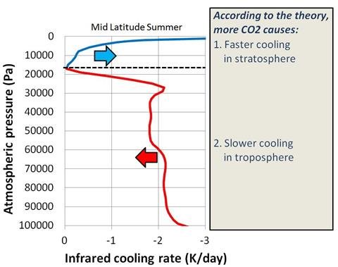
Now heres the detail of the science by those performing it.

Now if not even this extract from above can get you to educate yourself about co2 nothing will.


For the three day period, March 8th through 10th, the thermosphere absorbed 26 billion kWh of energy. Infrared radiation from CO2 and NO, the two most efficient coolants in the thermosphere, re-radiated 95% of that total back into space.


......


MAUNA LOA OBSERVATORY, Hawaii -- At nightfall, 11,000 feet up, under the summit of a looming volcano, the black lava moonscape cools as the sun's tropical heat escapes upward. Settling, subsiding, some of the world's purest air -- a sample of the entire central Pacific atmosphere -- descends on the dusk, cloaking Mauna Loa in stillness.

That's when John Barnes flips on his emerald-tinged laser and shoots it into the sky.

While it can reach up 60 miles, the primary target of Barnes' laser is the stratosphere, the cold, cloudless layer that sits atop the planet's bustling weather -- home of commercial jets and the ozone hole. The laser's concentrated 20 watts, a green beam visible miles away from the volcano, reflect off any detritus in its path, these wisps of evidence collected by the observatory's three large mirrors.

Barnes has kept a lonely watch for 20 years. Driving the winding, pothole-strewn road to this government-run lab, he has spent evening after evening waiting for the big one. His specialty is measuring stratospheric aerosols, reflective particles caused by volcanoes that are known to temporarily cool the planet. Only the most violent volcanic eruptions are able to loft emissions above the clouds, scientists thought, and so Barnes, after building the laser, waited for his time.

image_asset_6517.jpg

For nearly 20 years, John Barnes has fired his green laser into the skies above Hawaii's Mauna Loa volcano, monitoring particles suspended high above the weather. At night, the beam is visible for miles. Photo courtesy of John Barnes.

He waited. And waited.

And waited.

To this day, there hasn't been a major volcanic eruption since 1991, when Mount Pinatubo scorched the Philippines, causing the Earth to cool by about a half degree for several years. But Barnes diligently monitored this radio silence, identifying the background level of particles in the stratosphere. And then, sitting in his prefab lab four years ago, not far from where Charles Keeling first made his historic measure of rising atmospheric carbon dioxide levels, Barnes saw something odd in his aerosol records.

"I was just updating my graph, and I noticed that, 'Hey, this is increasing,'" Barnes said during a recent interview. It was unexpected. Where were these particles coming from, without a Pinatubo-style eruption? "No one had seen that before," he said.

Barnes had uncovered a piece of a puzzle that has provoked, frustrated and focused climate scientists over the past half decade. It is a mystery that has given cover to forces arrayed against the reality of human-driven global warming. And it is a question that can be easily stated: Why, despite steadily accumulating greenhouse gases, did the rise of the planet's temperature stall for the past decade?

"If you look at the last decade of global temperature, it's not increasing," Barnes said. "There's a lot of scatter to it. But the [climate] models go up. And that has to be explained. Why didn't we warm up?"

The question itself, while simple sounding, is loaded. By any measure, the decade from 2000 to 2010 was the warmest in modern history. However, 1998 remains the single warmest year on record, though by some accounts last year tied its heat. Temperatures following 1998 stayed relatively flat for 10 years, with the heat in 2008 about equaling temperatures at the decade's start. The warming, as scientists say, went on "hiatus."

The hiatus was not unexpected. Variability in the climate can suppress rising temperatures temporarily, though before this decade scientists were uncertain how long such pauses could last. In any case, one decade is not long enough to say anything about human effects on climate; as one forthcoming paper lays out, 17 years is required.

For some scientists, chalking the hiatus up to the planet's natural variability was enough. Temperatures would soon rise again, driven up inexorably by the ever-thickening blanket thrown on the atmosphere by greenhouse gases. People would forget about it.

But for others, this simple answer was a failure. If scientists were going to attribute the stall to natural variability, they faced a burden to explain, in a precise way, how this variation worked. Without evidence, their statements were no better than the unsubstantiated theories circulated by climate skeptics on the Internet.

"It has always bothered me," said Kevin Trenberth, head of the climate analysis section at the National Center for Atmospheric Research. "Natural variability is not a cause. One has to say what aspect of natural variability."

Trenberth's search has focused on what he calls "missing energy," which can be thought of as missing heat. The heat arriving and leaving the planet can be measured, if crudely, creating a "budget" of the Earth's energy. While this budget is typically imbalanced -- the cause of global warming -- scientists could account for where the heat was going: into warming oceans or air, or melting ice. In effect, the stall in temperatures meant that climatologists no longer knew where the heat was going. It was missing.

The hunt for this missing energy, and the search for the mechanisms, both natural and artificial, that caused the temperature hiatus are, in many ways, a window into climate science itself. Beneath the sheen of consensus stating that human emissions are forcing warmer temperatures -- a notion no scientist interviewed for this story doubts -- there are deep uncertainties of how quickly this rise will occur, and how much air pollution has so far prevented this warming. Many question whether energy is missing at all.

For answers, researchers across the United States are wrestling with a surge of data from recent science missions. They are flying high, sampling the thin clouds crowning the atmosphere. Their probes are diving into deep waters, giving unprecedented, sustained measures of the oceans' dark places. And their satellites are parsing the planet's energy, sampling how much of the sun's heat has arrived, and how much has stayed.

image_asset_6518.jpg

Barnes, right, with the laser at the heart of his aerosol monitoring; in the room next door, three mirrors, exposed at night through a creaking, skyward-facing hatch, collect wisps of the laser's reflections. Photo courtesy of Bess Dopkeen.

"What's really been exciting to me about this last 10-year period is that it has made people think about decadal variability much more carefully than they probably have before," said Susan Solomon, an atmospheric chemist and former lead author of the United Nations' climate change report, during a recent visit to MIT. "And that's all good. There is no silver bullet. In this case, it's four pieces or five pieces of silver buckshot."

This buckshot has included some familiar suspects, like the Pacific's oscillation between La Niña and El Niño, along with a host of smaller influences, such as midsize volcanic eruptions once thought unable to cool the climate. The sun's cycles are proving more important than expected. And there are suspicions that the vast uptick in Chinese coal pollution has played a role in reflecting sunlight back into space, much as U.S. and European pollution did decades ago.

These revelations are prompting the science's biggest names to change their views.

Indeed, the most important outcome from the energy hunt may be that researchers are chronically underestimating air pollution's reflective effect, said NASA's James Hansen, head of the Goddard Institute for Space Studies.

Recent data has forced him to revise his views on how much of the sun's energy is stored in the oceans, committing the planet to warming. Instead, he says, air pollution from fossil fuel burning, directly and indirectly, has been masking greenhouse warming more than anyone knew.

It is a "Faustian bargain," he said, and a deal that will come due sooner than assumed.

'Cherry-picked observation'
Some years, you have El Niño. Others, it's La Niña. Rarely does Super El Niño arrive.

Understanding the warming hiatus starts and ends, literally, with El Niño and La Niña, the Janus-faced weather trends of the Pacific Ocean. Every so often, due to reasons that elude scientists, the ocean's equatorial waters heat or cool to unusual degrees. These spells influence the world's climate on a short-term basis, including surges in temperature and precipitation, like the current Texas drought.

The record-setting year of 1998 saw one of the largest El Niños in modern history -- a Super El Niño. That summer, many Americans learned that what seemed like a foreign-sounding abstraction could cause brownouts halfway across the world, as the average temperature increased by 0.2 degrees Celsius. Conversely, the years stacked near the end of the hiatus period saw an unusual number of La Niñas, which helped suppressed global temperatures.

Researchers have long argued that using 1998 as a starting point was, then, unfair.

"Climate scientists were right that it was a cherry-picked observation, starting with an El Niño and ending with a La Niña," said Robert Kaufmann, a geographer at Boston University who recently studied the hiatus period.

The temperature spike of 1998 was not just about El Niño, though; it was also enabled by an absence in the air. From the 1950s to the late 1970s, it is now widely agreed that the smog and particles from fossil fuel burning, by reflecting some of the sun's light back into space, masked any heating that would be felt from increased greenhouse gases. As clean air laws began to pass in the United States and Europe, this pollution began to disappear in the 1990s, a process known as "global brightening."

It is difficult to overstate how important pollution has been to blocking the sun's energy. According to an influential energy budget prepared several years ago, human pollution, along with volcanic eruptions, masked 70 percent of the heating caused by greenhouse gases between 1950 and 2000. Another 20 percent of this heating escaped into space, with 10 percent going into warming the climate, largely in the oceans.

By the late 1990s, much of this pollution had vanished. The sun was unleashed, no longer filtered, and greenhouse gases were continuing to trap more of its heat. There had been no eruptions since Pinatubo. El Niño flared. Conditions were perfect for a record.

When the record came in 1998, though, scientists faltered. It's a pattern often seen with high temperatures. They cut out too much nuance, said John Daniel, a researcher at the Earth System Research Lab of the National Oceanic and Atmospheric Administration.

"We make a mistake, anytime the temperature goes up, you imply this is due to global warming," he said. "If you make a big deal about every time it goes up, it seems like you should make a big deal about every time it goes down."

For a decade, that's exactly what happened. Skeptics made exaggerated claims about "global cooling," pointing to 1998. (For one representative example, two years ago columnist George Will referred to 1998 as warming's "apogee.") Scientists had to play defense, said Ben Santer, a climate modeler at Lawrence Livermore National Laboratory.

"This no-warming-since-1998 discussion has prompted people to think about the why and try to understand the why," Santer said. "But it's also prompted people to correct these incorrect claims."

Even without skeptics, though, the work explaining the hiatus, and especially refining the planet's energy imbalance, would have happened, NASA's Hansen added.

It was in no "way affected by the nonsensical statements of contrarians," Hansen said. "These are fundamental matters that the science has always been focused on. The problem has been the absence of [scientific] observations."

Gradually, those observations have begun to arrive.

Sunshine
The answer to the hiatus, according to Judith Lean, is all in the stars. Or rather, one star.

For decades, it has been known that the sun moves through irregular, 11-year cycles that see its magnetic activity wax and wane. During the solar minimums, the sun's surface is quiet and relatively still; during maximums, it is punctuated by salt and pepper magnetic distortions: dark sun spots, which decrease its radiance, and hot white "faculae," torches of light that increase its radiance. Overall, during maximums the faculae seem to win out, causing the sun's brightness to increase by 0.1 percent.

Only recently have climate modelers followed how that 0.1 percent can influence the world's climate over decade-long spans. (According to best estimates, it gooses temperatures by 0.1 degrees Celsius.) Before then, the sun, to quote the late comedian Rodney Dangerfield, got no respect, according to Lean, a voluble solar scientist working out of the the space science division of the Naval Research Laboratory, a radar-bedecked facility tucked away down in the southwest tail of Washington, D.C.

image_asset_6519.jpg

Founded in the 1950s, the Mauna Loa Observatory is perched near the summit of an active volcano, 11,000 feet above sea level. The volcano last erupted in 1984, giving the observatory a scare. They have since plowed a barrier to divert potential lava: "They told me it would work," Barnes said. Photo courtesy of Bess Dopkeen.

Climate models failed to reflect the sun's cyclical influence on the climate and "that has led to a sense that the sun isn't a player," Lean said. "And that they have to absolutely prove that it's not a player."

This fading bias stems from the fervent attachment some climate skeptics have to the notion that the sun, not human emissions, caused global warming over the past few decades. As Lean notes, such a trend would require the sun to brighten more in the past century than any time in the past millennium, a dynamic unseen during 30 years of space observation. Yet fears remained that conceding short-term influence, she said, would be like "letting a camel's nose into the tent."

NASA's Hansen disputes that worry about skeptics drove climate scientists to ignore the sun's climate influence. His team, he said, has "always included solar forcing based on observations and Judith's estimates for the period prior to accurate observations."

There has been a change, however, he added. Previously, some scientists compared the sun's changing heat solely to the warming added by greenhouses gases and not the combined influence of warming gases and cooling pollution. And if air pollution is reflecting more sunlight than previously estimated, as Hansen suspects, the sun will indeed play an important role, at least in the upcoming decades.

"That makes the sun a bit more important, because the solar variability modulates the net planetary energy imbalance," Hansen said. "But the solar forcing is too small to make the net imbalance negative, i.e., solar variations are not going to cause global cooling."

According to Lean, the combination of multiple La Niñas and the solar minimum, bottoming out for an unusually extended time in 2008 from its peak in 2001, are all that's needed to cancel out the increased warming from rising greenhouse gases. Now that the sun has begun to gain in activity again, Lean suspects that temperatures will rise in parallel as the sun peaks around 2014.

There's still much to learn about the sun's solar cycles. Satellites are tricky. Lean spends much of her time separating what are changes in brightness versus instrument problems on satellites. (Her favorite error? Proteins accumulating on a camera lens, introducing spurious trends.) Meanwhile, she has also found that the past three solar cycles, confoundedly, each had similar changes in total brightness, despite the first two cycles being far more abundant in sun spots and faculae than the last.

This consistent trend has prompted Lean to take a rare step for a climate scientist: She's made a short-term prediction. By 2014, she projects global surface temperatures to increase by 0.14 degrees Celsius, she says, driven by human warming and the sun.

Will her prediction come true? Check back in with her in three years, she said.

Small volcanic eruptions
Five years ago, a balloon released over Saharan sands changed Jean-Paul Vernier's life.

Climbing above the baked sand of Niger, the balloon, rigged to catch aerosols, the melange of natural and man-made particles suspended in the atmosphere, soared above the clouds and into the stratosphere. There, Vernier expected to find clear skies; after all, there had been no eruption like Pinatubo for more than a decade. But he was wrong. Twelve miles up, the balloon discovered a lode of aerosols.

Vernier had found one slice of the trend identified by Barnes at Mauna Loa in Hawaii. It was astonishing. Where could these heat-reflecting aerosols be originating? Vernier was unsure, but Barnes and his team hazarded a guess when announcing their finding. It was, they suggested, a rapidly increasing activity in China that has drawn plenty of alarm.

"We suggested that it was coal burning," Barnes said.

Among the many chemicals released by coal burning is sulphur dioxide, a gas that forms a reflective aerosol, called sulfate, in the sky. While this pollution is well-known for its sun-blocking talents, few suspected that sulphur dioxide from coal power plants could reach the stratosphere. It was a controversial hypothesis. Only the sulphur gas from Pinatubo-like events should reach that high.

A French scientist who moved to NASA's Langley Research Center in Virginia to study aerosols, Vernier, like Barnes, turned toward a laser to understand these rogue sulfates. But rather than using a laser lashed to the ground, he used a laser in space.

The same year as the Niger balloon campaign, NASA had launched a laser-equipped satellite aimed at observing aerosols among the clouds. Vernier and his peers suspected, with enough algorithmic ingenuity, that they could get the laser, CALIPSO, to speak clearly about the stratosphere. The avalanche of data streaming out of the satellite was chaotic -- too noisy for Barnes' taste, when he took a look -- but several years on, Vernier had gotten a hold of it. He had found an answer.

Mostly, the aerosols didn't seem to be China's fault.

Thanks to CALIPSO's global coverage, Vernier saw that his sulfate layer stemmed from a mid-size volcanic eruption at the Soufrière Hills volcano in Montserrat, a tiny British island in the Lesser Antilles.

The satellite found that the eruption's plume floated into the stratosphere, carried upward by an equatorial air current. Digging back into other satellite data, this summer Vernier identified other midsize eruptions that reached the stratosphere: Indonesia and Ecuador in 2002 and Papua New Guinea in 2005.

"They've pretty much shown that it's not really coal burning," Barnes said. "There were three eruptions that were kind of spaced ... and that's really what was making the increase. You'd still think that the coal burning could be part of it. But we really don't have a way to separate out the two tracks."

Vernier's work came to the attention of Susan Solomon, an atmospheric chemist with NOAA who had been working with Barnes' data to puzzle out if this "background" of stratospheric sulfates had helped cause the stall in temperatures. On a decadelong scale, even a tenth of a degree change would have been significant, she said.

Solomon was surprised to see Vernier's work. She remembered the Soufrière eruption, thinking "that one's never going to make it into the stratosphere." The received wisdom then quickly changed. "You can actually see that all these little eruptions, which we thought didn't matter, were mattering," she said.

Already Solomon had shown that between 2000 and 2009, the amount of water vapor in the stratosphere declined by about 10 percent. This decline, caused either by natural variability -- perhaps related to El Niño -- or as a feedback to climate change, likely countered 25 percent of the warming that would have been caused by rising greenhouse gases. (Some scientists have found that estimate to be high.) Now, another dynamic seemed to be playing out above the clouds.

In a paper published this summer, Solomon, Vernier and others brought these discrete facts to their conclusion, estimating that these aerosols caused a cooling trend of 0.07 degrees Celsius over the past decade. Like the water vapor, it was not a single answer, but it was a small player. These are the type of low-grade influences that future climate models will have to incorporate, Livermore's Santer said.

"Susan's stuff is particularly important," Santer said. "Even if you have the hypothetical perfect model, if you leave out the wrong forcings, you will get the wrong answer."

'Missing energy'?
As scientists have assembled these smaller short-term influences on the climate, a single questionable variable has girded, or threatened to undermine, their work: It is far from clear how much absent warming they should be hunting.

For several years, Trenberth, at the National Center for Atmospheric Research, has challenged his colleagues to hunt down the "missing energy" in the climate. Indeed, much to his chagrin, one such exhortation was widely misinterpreted when Trenberth's letters leaked from the University of East Anglia's Climatic Research Unit in 2009. Trenberth has received so many queries related to the email that half his professional website debunks misreadings of a single sentence he wrote years ago.

Until 2003, scientists had a reasonable understanding where the sun's trapped heat was going; it was reflected in rising sea levels and temperatures. Since then, however, heat in the upper ocean has barely increased and the rate of sea level rise slowed, while data from a satellite monitoring incoming and outgoing heat -- the Earth's energy budget -- found that an ever increasing amount of energy should be trapped on the planet. (Some scientists question relying on this satellite data too heavily, since the observed energy must be drastically revised downward, guided by climate models.) Given this budget ostensibly included the solar cycle and aerosols, something was missing.

Where was the heat going? Trenberth repeated the question time and again.

Recently, working with Gerald Meehl and others, Trenberth proposed one answer. In a paper published last month, they put forward a climate model showing that decade-long pauses in temperature rise, and its attendant missing energy, could arise by the heat sinking into the deep, frigid ocean waters, more than 2,000 feet down. The team used a new model, one prepared for the next U.N. climate assessment; unlike past models, it handles the Pacific's variability well, which "seems to be important," Trenberth said.

image_asset_6520.jpg

A collection of prefab buildings and expensive electronics, Mauna Loa Observatory is exposed to freezing conditions and peaks of UV radiation. Dry and sunny, it is a far cry from the rainforest conditions in Hilo, the faded seaside town where Barnes and his staff live, commuting to the volcano once or twice a week. Photo courtesy of Bess Dopkeen.

"In La Niña, the colder sea surface temperatures in the Pacific mean there is less convective action there -- fewer tropical storms, etc., and less clouds, but thus more sun," he said. "The heat goes into the ocean but gets moved around by the ocean currents. So ironically colder conditions lead to more heat being sequestered."

It is a compelling illustration of how natural variability, at least in this model, could overcome the influence of increasing greenhouse gases for a decade or more, several scientists said. However, according to one prominent researcher -- NASA's Hansen -- it's a search for an answer that doesn't need to be solved.

That is because, according to Hansen, there is no missing energy.

Over the past decade, for the first time, scientists have had access to reliable measures of the ocean's deep heat, down to 5,000 feet below sea level, through the Argo network, a collection of several thousand robotic probes that, every few days, float up and down through the water column. This led Hansen to conclude that net energy imbalance was, to be briefly technical, 0.6 watts per square meter, rather than more than 1 watt per square meter, as some had argued.

(Recently, the satellite group measuring the energy imbalance has revised its figure, which now sits at 0.6 watts, matching Hansen's estimate, according to Graeme Stephens, the head of NASA's Cloudsat mission. It suggests there isn't a missing energy. Trenberth disagrees with this analysis, and it's likely to be a question of ongoing debate.)

More fundamentally, the Argo probe data has prompted Hansen to revise his understanding of how the climate works in a fundamental way, a change he lays out in a sure-to-be-controversial paper to be published later this year.

For decades, scientists have known that most of the heat trapped by greenhouse gases was going into the ocean, not the atmosphere; as a result, even if emissions stopped tomorrow, they said, the atmosphere would continue to warm as it sought balance with the overheated oceans. In a term Hansen coined, this extra warming would be "in the pipeline," its effects lingering for years and years. But exactly how much warming would be in the pipeline depended on how efficiently heat mixed down into the oceans.

Hansen now believes he has an answer: All the climate models, compared to the Argo data and a tracer study soon to be released by several NASA peers, exaggerate how efficiently the ocean mixes heat into its recesses. Their unanimity in this efficient mixing could be due to some shared ancestry in their code. Whatever the case, it means that climate models have been overestimating the amount of energy in the climate, seeking to match the surface warming that would occur with efficient oceans. They were solving a problem, Hansen says, that didn't exist.

At first glance, this could easily sound like good news, if true. But it's not.

"Less efficient mixing, other things being equal, would mean that there is less warming 'in the pipeline,'" Hansen said. "But it also implies that the negative aerosol forcing is probably larger than most models assumed. So the Faustian aerosol bargain is probably more of a problem than had been assumed."

Essentially, future warming may be more in human control than expected, but if aerosols, either directly or through their role in forming clouds, are blocking more of the sun's heat than realized, than the continued demise of these particles due to air pollution controls could see surface temperatures rise rapidly -- Hansen's "Faustian" bargain.

Hansen's paper is prompting discussion throughout the climate science community, even before its publication. Putting a hard number on the reflectivity caused by aerosols and the clouds they seed has been one of the science's main goals, and Hansen, according to John Seinfeld, an atmospheric chemist at Caltech who has reviewed a draft of the study, has constrained that uncertainty, if not removed it entirely.

Trenberth questions whether the Argo measurements are mature enough to tell as definite a story as Hansen lays out. He has seen many discrepancies among analyses of the data, and there are still "issues of missing and erroneous data and calibration," he said. The Argo floats are valuable, he added, but "they're not there yet."

When looking at the decade of stalled warming in light of these findings, it is clear that the solar minimum and volcanic sulfates played a role in lowering the energy imbalance. But focusing on them is a bit like -- and here Hansen invokes a hoary science truism -- the drunk looking for his keys underneath a streetlight. He lost his keys out in the darkness, but searches beneath the lamp, he says, because that's where the light is.

"Unfortunately, when we focus on volcanic aerosol forcing, solar forcing and stratospheric water vapor changes, it is a case of looking for our lost keys under the streetlight," Hansen said. "What we need to look at is the tropospheric aerosol forcing, but it is not under the street light."

And hidden in that darkness, somewhere, is the role of Chinese coal.

Scrubbers for Chinese power plants
It seems obvious now. Global brightening couldn't last forever.

It is the biggest unknown of the past decade. During that time, fueling its unparalleled growth, Chinese coal consumption increased 200 percent, from 1.2 million to 3.7 million tons. At least at first, much of this burning came without the controls used in the West to prevent sulphur dioxide emissions. According to one study, China's sulphur emissions rose 53 percent between 2000 and 2006. Maybe this pollution didn't reach the stratosphere, as Barnes suspected, but surely it has been reflecting sunlight?

It's a reasonable suspicion, but far from clear, NASA's Hansen said.

"I suspect that there has been increased aerosols with the surge in coal use over the past half decade or so," he said. "There is semi-quantitative evidence of that in the regions where it is expected. Unfortunately, the problem is that we are not measuring aerosols well enough to determine their forcing and how it is changing."

This past summer, Robert Kaufmann, the BU geographer, made waves when he released a modeling study suggesting that the hiatus in warming could be due entirely to El Niño and increased sulfates from China's coal burning. While the figures Kaufmann used for the study were based on the country's coal combustion, and not actual emissions -- a big point of uncertainty -- many scientists saw some truth in his assertions.

During the 1980s and '90s, the rapid decline of air pollution in the United States and Europe dominated the world's aerosol trends. While those emissions have continued to decline in the West, returns, from a brightening standpoint, have diminished, just as coal combustion ramped up in Asia. It's not that the world is getting dimmer again; it's that it's no longer getting brighter.

"It's not an obvious overall trend anymore," said Martin Wild, a lead author of the United Nations' next climate assessment at the Swiss Federal Institute of Technology, Zurich. But, he added, "it fits quite well with [coal power] generation. For me, it's quite striking that it seems to fit quite nicely. But it could still be by chance."

Kaufmann's study originated in a public talk he gave about climate change, he said. During the question time, a "regular guy" stood up and told Kaufmann that he had heard on the radio that the climate hasn't warmed in 10 years. He was piqued. Digging into relevant studies, he then saw a bunch of "nonsense" in the literature decrying the unfair use of 1998, the Super El Niño year, as a baseline.

Skeptics had thrown down a gauntlet. It had to be picked up.

image_asset_6521.jpg

Mauna Loa was the site for Charles Keeling's work demonstrating rising CO2 levels in the atmosphere. A careful experimentalist, within five years Keeling had identified the trend. "It was an amazing data set," Barnes said. "Here we are out in the middle of the Pacific, 4,000 kilometers from [major] cities, and we're seeing the atmosphere being affected by fossil fuels." Photo courtesy of Bess Dopkeen.

"If you have a good model of climate, it should be able to explain what's going on in any 10-year period," he said. A few years back, he had devised his own model, based on principles from econometrics, rather than physics simulations. It seemed a perfect time to bring its code out of mothballs in search of an answer. It settled on Chinese coal.

Kaufmann's findings may only be relevant for so long. Since 2006, China has begun to mandate scrubbers for its coal-fired power plants, though it is uncertain how often the scrubbers, even when installed, are operated. But change is coming, said Daniel Jacob, an atmospheric chemist at Harvard University.

"The sulfate sources have been leveling off, because they've been starting to put serious emission controls on their power plants," Jacob said. "It's interesting. When you look at the future emission scenarios from the [next U.N. climate report], you see SO2 emissions dropping like a rock, even in the coming decades. Because basically China is going to have to do something about its public health problem."

More scrubbers -- good news for the Chinese, but not for short-term warming.

"You could have a repeat of the rapid warming of 1980s and 1990s," Kaufmann said.

Debate rages on
On the top of Mauna Loa, there are no concerns about air pollution.

During the day, as Barnes gives a tour of the site's odd mix of steel containers and sophisticated sensors to a group of college students from Quebec, he points out over the ocean to Maui, where the summit of Haleakala is visible, more than 85 miles away.

"That you can see it tells you something about how clear the air is," he said.

After the tour, sitting in his office, his laser in the next room, Barnes laments the boggling complexity of separating all the small forcings on the climate. It makes Charles Keeling's careful work identifying rising CO2 levels seem downright simple.

"It's really subtle," he said. "It's hard to track how much is going into the oceans, because the oceans are soaking up some of the heat. And in a lot of places the measurements just aren't accurate enough. We do have satellites that can measure the energy budget, but there's still assumptions there. There's assumptions about the oceans, because we don't have a whole lot of measurements in the ocean."

Indeed, many of the scientists sorting out the warming hiatus disagree with one another -- in a chummy, scholarly way. Judith Lean, the solar scientist, finds Kaufmann's work unpersuasive and unnecessarily critical of China. Kaufmann finds Solomon's stratosphere studies lacking in evidence. Hansen and Trenberth can't agree on a budget.

It seems staggering, then, that in a few years' time a new consensus will form for the next U.N. climate change report. But it will, and lurking beneath it will remain, as always, the churning theories and rivalries, the questions, the grist of scientific life.

So, in the end, can anyone say explicitly what caused the warming hiatus?

"All of these things contribute to the relative muted warming," Livermore's Santer said. "The difficultly is figuring out the relative contribution of these things. You can't do that without systematic modeling and experimentation. I would hope someone will do that."

Data will continue to arrive. Scientists are getting a better feel on the particulars of aerosols, and NASA's Hansen has high hopes that satellites accurate enough to measure the climate influences of aerosols will come soon. (The crash earlier this year of the Glory satellite was devastating; it would have provided that data. A replacement is scheduled for 2016.)

Meanwhile, the Argo ocean robots will improve, and Trenberth and Lean are pitching a low-cost program to NASA that will place devices to measure the planet's energy budget, in a global way, on the next fleet of Iridium phone satellites.

Barnes, for his part, would love to separate whether any background aerosols he found tucked away in the stratosphere came from Chinese coal burning. It is difficult to figure out, but he has some hope it could happen.

"Maybe when coal burning triples," he said, "then we might sort it out."
 
Last edited:
The focus on the science should not be relying on these fish farmer experts for the valid science or consensus. This is a global science that billions of dollars are spent annually, and trillions of dollars are at stake to get the science right. We would be fools to depend on these fish farmers for the correct answers.

Also, thanks to the scientists around the world taking core samples, examining fossil records, we know there are climatic tipping points that can change sea levels and weather patterns for thousands to millions of years.

Humans might not directly do the damage but might cause a "butterfly" effect that starts the avalanche. For example, once the ice/snow reflectivity drops too much, then the sea ice and land ice can melt more causing more warming... it sets off a snowball effect with lower Earth surface reflectivity levels... and a cycle spins out of our control that feeds off itself... then all of that "stored energy" can be released... humans don't do that... nature does. Ocean currents could be altered by the additional fresh water released from the snow/ice thereby changing more weather patterns... a mini-ice age for Europe?

Once tundra is exposed to higher temps without the protective white blanket of snow ice more methane is released that was once locked-in the tundra. Another massive "nature force" of methane could be released that humans cannot control on global scales.

Billions of humans are under threat of mass migrations and starvations and loss of coastlines where populations are concentrated, so we need serious climate and weather science being done worldwide on a global scale. University and Government and Private Science centers need to work towards consensus about what is happening. I do NOT want Humankind being dependent upon fish farmer analysis or political based agendas.
 
Buy a gas mask m8.

And if you think you can falsify just one of the Connolly's results, you go right ahead, let us watch you do just that.

You will find their technical papers on site, you can download all source code etc to run their experiments yourself, then you can discuss any dis-agreement in the comments there, or on twitter, or by email or that the journal.

Good luck, after all they are only fish farmers, go get em tiger.

We have just lost a poster to an almighty strop, he was just like you, focused on that methane, its a shame you missed him you have alot in common, apart from the hard-on for chris.
 
Back
Top