Once again you comeup empty..
Maybe you will have better luck with sea levels.
Hollywood and the media have helped created a popular perception that humans are causing dramatic sea level rises by man-made global warming. This perception comes from an exaggeration of more modest, though still dramatic, computer model predictions of 1-2 metre rises by the end of the 21st century. However, the actual experimental data shows, at most, a slow and modest increase in sea levels, which seems completely unrelated to CO2 concentrations.
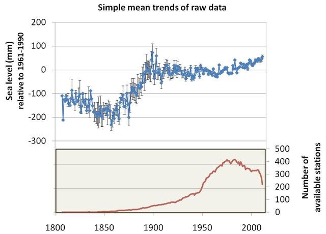
The main estimates of long-term sea level changes are based on data from various tidal gauges located across the globe. These estimates apparently suggest a sea level rise of about 1 to 3mm a year since records began. This works out at about 10-30cm (4-12 inch) per century, or about a 1 foot rise every 100-300 years, hardly the scary rates implied by science fiction films like The Day After Tomorrow (2004) or Waterworld (1995).
Importantly, the rate still seems to be about the same as it was at the end of the 19th century, even though carbon dioxide emissions are much higher now than they were during the 19th century.
Moreover, there are a number of problems in using the tidal gauge data which have not been resolved yet. So, despite claims to the contrary, it is still unclear if there has actually been any long term trend! In this essay, we will summarise what is actually known about current sea level trends.
1. Introduction
Under conditions of global warming, sea levels are expected to rise for two main reasons:
For the same reasons, global cooling should similarly lead to falling sea levels. So, if global temperatures have been changing dramatically over the centuries, then we might expect this to have also caused substantial changes in global sea levels.
As we discuss on this website, many people believe that global temperature trends have been dominated by “man-made global warming”, and that this man-made global warming will become increasingly dramatic over the next century. For this reason, there is a widespread belief that increasing concentrations of CO2 are leading to unusual rises in sea level.
A number of the man-made global warming computer models have tried to simulate how much “sea level rise” to expect from man-made global warming, e.g., Meehl et al., 20015 (Abstract; Google Scholar access); Jevrejeva et al., 2010 (Abstract; Google Scholar access); Jevrejeva et al., 2012 (Abstract; Google Scholar access).
Vermeer & Rahmstorf, 2009 (Open access) believe that the computer models underestimate future sea level changes. So, they didn’t actually simulate sea level changes, but instead estimated how much sea level rise they would expect from man-made global warming, and then used computer model predictions of temperature changes, to predict that sea levels will have risen by 0.8-2 metres by 2100. (The blogger Tom Moriarty has heavily criticised the Vermeer & Rahmstorf, 2009 study on his Climate Sanity blog)

Figure 1. In theory, if a large mass of glaciers or ice sheets melted, this could cause a global sea level rise. Similarly, if glaciers or ice sheets expanded, this could cause a global sea level fall. Photo of Antarctica's Mt. Herschel by Andrew Mandemaker, taken from Wikimedia Commons. Click to enlarge.
Other researchers, such as Dr. James Hansen of NASA GISS, have hypothesised that man-made global warming will be so strong that it could cause the large ice sheets on Greenland, East Antarctica or West Antarctica to suddenly melt, leading to sudden and dramatic sea level rises of several metres, e.g., Hansen, 2005 (Abstract; .pdf available on NASA GISS website). Hansen and others have been promoting these scary scenarios since the early 1980s (e.g., see this New York Times article from August, 1981), and it is from such sources that the Hollywood stories seem to originate (e.g., Hansen was the main scientific advisor for Al Gore’s An Inconvenient Truth film and book).
So, are these scary model predictions reliable, and should we be worried?
Well, in this post, we will forget about the models, and look at what the actual data says. We will find that the data suggests that at most sea levels have risen by 15-20cm since the end of the 19th century. That’s not particularly dramatic. But, if you believe in man-made global warming theory, then you might say “aha, that’s due to CO2, and it will get worse”.
However, the apparent sea level rise seems to have been relatively constant over the last century. If it was due to CO2, we would expect to see a dramatic acceleration since the 1950s, as CO2 concentrations increased. Since this doesn’t seem to have occurred (despite some claims to the contrary – see Section 5), it suggests that the apparent sea level rise is a naturally-occurring phenomenon (perhaps due to natural global warming).
We will also find that there are a number of serious problems with the available sea level data. As a result, much (perhaps all) of the apparent sea level rise might be due to problems with the data. In other words, we do not actually know if there has been any significant sea level trends over the last century!
Astute readers will object and complain that there must have been some sea level trends over the last century. This is because, from the discussion above, we would expect to see sea level changes, since global temperatures do seem to have changed over the last century (whether the temperature trends are man-made or natural in origin). However, as we will discuss in the next section, this is not necessarily the case.
We might expect “global warming” (i.e., an increase in average surface air temperatures over a few decades) to lead to a rise in global mean sea levels. But, for the reasons we will discuss in Section 2, it is also theoretically possible that it could have no detectable net effect on global mean sea levels, or even lead to a net fall! Hence, when we look at the actual sea level records in Sections 3, 4 & 5, we should avoid biasing our analysis with our own views of what we think “should happen”:
“If a man will begin with certainties, he shall end in doubts. But, if he will be content to begin with doubts, he shall end in certainties” – Francis Bacon, Sr. (1561-1626)
2. Problems predicting global sea level changes
The density problem
The density of a liquid tells you the volume that a given mass of that liquid occupies. If the total mass of a liquid in a container (e.g., an ocean basin!) remains constant, but its density increases, then the volume of that liquid will decrease. Hence, the maximum height of the container that is reached by the liquid will decrease. In our case where the “container” is an ocean basin, this would mean a fall in the “global mean sea level”. Similarly, if the liquid density decreases, the maximum height reached will increase. This is the basis for the first theoretical prediction for the effects of global warming mentioned in Section 1 – if global warming causes the oceans to heat up, this should (in theory) cause sea levels to rise, from “thermal expansion”.

Figure 2. The anomolous expansion of liquid water with cooling at temperatures less than 4 °C, means that the bottom of a frozen garden pond can remain relatively warm, if it is deep enough. Schematic taken from Wikimedia Commons. Click to enlarge.
One problem with the thermal expansion theory is that the relationship between temperature and density is different for water than for most liquids. Like most liquids, when you cool pure liquid water from high temperatures, its density steadily decreases. However, unlike most liquids, water actually reaches its maximum liquid density several degrees above its freezing point, i.e., at 4°C instead of 0°C. Between 0°C and 4°C, water actually expands as it cools.
This is why ice (frozen water at 0°C or less) floats! It is also why fish that can survive at 4°C can overwinter in a garden pond that has ice on the top, by staying near the bottom of the pond (see Figure 2). This means that if global warming uniformly warmed up all of the oceans by 0.5°C (for example), some parts would certainly expand (water above 4°C), but other parts would actually contract (water above 0°C, but less than 4°C).

Figure 3. Maps of ocean salinity at different ocean depths - top: surface; middle: 1km deep; bottom: 4km deep. Note that the colour scales are different for each map. Also, some areas are grey in the lower maps, because the ocean floor is not that deep in those areas. Taken from NOAA NODC's World Ocean Atlas (2009). Click to enlarge.
Another problem is that the oceans are not pure freshwater. As anyone who has swam in the sea knows, seawater is salty. The amount of salt in seawater (known as its “salinity”) affects both its density and its freezing point.
Salty water freezes at lower temperatures than pure water – that’s why we grit roads with salt if we’re expecting icy conditions. Salty water is also more dense than pure water. For this reason, the density of seawater depends not only on its temperature, but also its salinity. As can be seen from the maps in Figure 3, the salinity of the oceans varies across the world, e.g., the Atlantic Oceans are slightly saltier than the Pacific Oceans. This regional variability also varies with depth.
Indeed, this complex dependence of ocean density on both temperature and salinity is believed to be one of the main drivers of the ocean circulation, as redistribution of more dense and less dense sea water leads to various different “thermohaline circulations” patterns. [The name “thermohaline” is derived from “thermo” for temperature and “haline” for salinity].
As a result, the effects of global warming or global cooling on ocean densities are complex, and still poorly understood. For instance, suppose the oceans were to uniformly heat up or cool down by 0.5°C (for instance). If that were to occur, then the density changes at a particular spot would depend on not just the temperature change, but also the absolute temperature and salinity at that spot. In reality, global warming or cooling (whether man-made or natural in origin) is unlikely to occur uniformly throughout the oceans, e.g., temperature changes usually vary with latitude and depth, and depend on ocean circulations.
Effects of human activity on water storage

Figure 4. To meet water requirements for expanding populations, many groundwater pumps have taken to pumping water from further and further below ground. In some cases, they may be extracting water that has been underground for thousands of years. Schematic of water age taken from Wikimedia Commons. Click to enlarge.
Another complexity is that the actual amount of water involved in the “water cycle” may have changed over the years. Rapid expansion in groundwater exploitation (e.g., using well water) occurred during 1950–1975 in many industrialized nations and during 1970–1990 in most parts of the developing world – see Foster & Chilton, 2003 (Open access), for a discussion. After this groundwater has been extracted from the ground, it is used and recycled. Eventually, much of it will end up in the oceans. In this way, humans could be significantly raising sea levels by taking groundwater that had until recently been trapped underground, and putting it back into the water cycle.
If this phenomenon is significant, it would mean that the sea level rise which had been specifically attributed to global warming has been overestimated, e.g., see Sahagian et al., 1994(Abstract).

Figure 5. Have humans been reducing sea levels by building so many dams? Photo of the reservoir next to the city of Embalse, Córdoba, Argentina taken from Wikimedia Commons. Click to enlarge.
On the other hand, humans have also built a lot of dams to store water, particularly during the 20th century. Perhaps by doing so, we are reducing sea levels by preventing water from returning to the oceans. If this phenomenon is significant, then it would mean that the sea level rise which had been attributed to global warming may have been underestimated, e.g., see Gornitz et al., 1997 (Abstract; Google Scholar access).
Other types of human activity, such as deforestation/reforestation, could also be having significant effects on global sea levels (either increases or decreases). So, since the 1990s, a number of groups have tried to calculate these various contributions to changes in sea levels, although typically most studies have concentrated on just one contribution at a time.
The relative contributions of these different factors has been a subject of much debate, and seems to be ongoing. For example, studies such as Chao et al., 2008 (Abstract; Google Scholar access) claim human dam building has led to an underestimate of sea level rises due to global warming, while other studies, such as Wada et al., 2010 (Abstract; Google Scholar access) argue that ground water extraction has led to an overestimate of sea level rises due to global warming.
Effects of climate change on water storage
The above discussion of the effect of changes in water storage on land from human activity on global sea-levels, should not be confused with possible changes in water storage on land from climate change (whether man-made or natural).
Climate change could involve changes in the water cycle, thereby altering how much and how long water stays on land instead of in the sea, i.e., the amount of ground water and soil water. It could also affect the amount of snowfall. In addition, global warming or cooling (the most commonly thought of examples of climate change) could decrease or increase the length of time snow remains un-melted (and thereby keeping water “trapped” on land).
These climate-related land storage effects could be significant for global sea-levels, though unfortunately there seem to be very few direct experimental measurements of the factors involved, and so the only studies of these effects seem to have been from computer modelling of data from weather data “reanalysis” models (e.g., ERA-40).
These studies often yield contradictory results. For instance, Milly et al., 2003 (Open access) used computer simulations and results from the CMAP reanalysis of precipitation levels to calculate that climate-related changes in water storage on land were causing a sea-level rise of about 0.12 mm/year in the period 1981-1998 (although, they admitted they couldn’t calculate an error bar for that estimate). But, Ngo-Duc et al., 2005 (Abstract; Google Scholar access) obtained a much smaller value of 0.08 mm/year for the same period. They also found that if they looked over the longer period of 1948-2000, there was no significant trend in sea-level rise or fall, and that the 0.08 mm/year sea-level rise they calculated in the period 1981-1998 was probably due to natural variability.
What else?
In this section, we discussed several mechanisms whereby the expected sea level rises (or falls) from global warming (or cooling) might not actually occur. There may be other mechanisms which we haven’t mentioned, too. For instance, if global warming were to increase the volume of water in the oceans by causing glaciers or other ice bodies to melt, this would cause the weight of water in the oceans to increase. But, in doing so, this could in turn cause the ocean floors to sink, and thereby slightly reduce the expected sea level rise.
Before considering all the complexities mentioned above, it might have seemed a relatively easy problem to calculate how much sea level rise (or fall) to expect for a given global warming (or cooling) of, e.g., 0.5°C. This seems to be the popular assumption, even amongst climate scientists. But, in reality, it is a very complex problem. Readers should remember the American satirist, H. L. Mencken (1880-1956), who observed that:
There is always an easy solution to every human problem – neat, plausible, and wrong. - Henry Louis Mencken, 1917
We appreciate that many people like to have an easy answer to what they consider a simple question. But, unfortunately, if a simple answer is too simplistic, it is often wrong. With this in mind, rather than trying to make simplistic models to understand sea level changes, perhaps a better approach is to look at what the experimental data actually says. This is what we will attempt to do in the next sections.
Maybe you will have better luck with sea levels.
Hollywood and the media have helped created a popular perception that humans are causing dramatic sea level rises by man-made global warming. This perception comes from an exaggeration of more modest, though still dramatic, computer model predictions of 1-2 metre rises by the end of the 21st century. However, the actual experimental data shows, at most, a slow and modest increase in sea levels, which seems completely unrelated to CO2 concentrations.
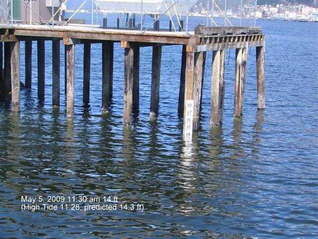
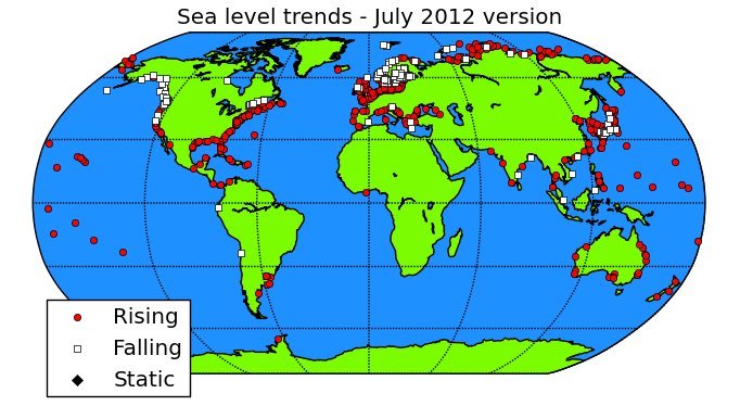
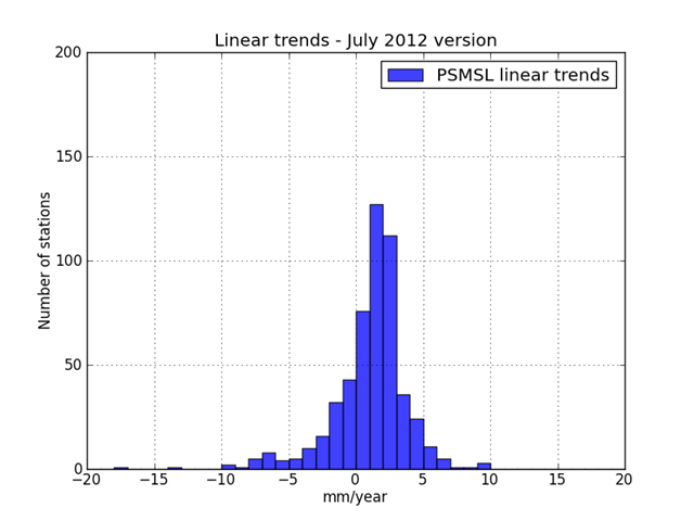
The main estimates of long-term sea level changes are based on data from various tidal gauges located across the globe. These estimates apparently suggest a sea level rise of about 1 to 3mm a year since records began. This works out at about 10-30cm (4-12 inch) per century, or about a 1 foot rise every 100-300 years, hardly the scary rates implied by science fiction films like The Day After Tomorrow (2004) or Waterworld (1995).
Importantly, the rate still seems to be about the same as it was at the end of the 19th century, even though carbon dioxide emissions are much higher now than they were during the 19th century.
Moreover, there are a number of problems in using the tidal gauge data which have not been resolved yet. So, despite claims to the contrary, it is still unclear if there has actually been any long term trend! In this essay, we will summarise what is actually known about current sea level trends.
- 1. Introduction
- 2. Problems predicting global sea level changes
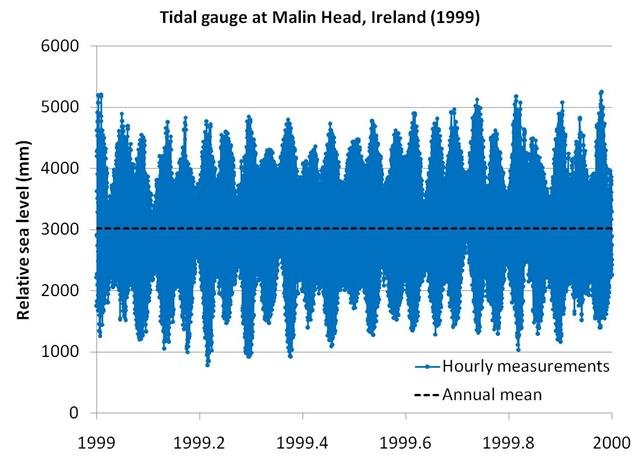
- 3. Tidal gauge estimates
- 4. Is the sea rising or is the land falling?
- 5. Satellite estimates
- 6. Final remarks
1. Introduction
Under conditions of global warming, sea levels are expected to rise for two main reasons:
- In general, when liquids warm, they tend to expand. Therefore, if the oceans warm up, their volume should also increase, leading to a rise in the global sea level.
- If global warming causes glaciers or ice sheets (i.e., ice on land) to melt, then the meltwater should increase the ocean volume.
For the same reasons, global cooling should similarly lead to falling sea levels. So, if global temperatures have been changing dramatically over the centuries, then we might expect this to have also caused substantial changes in global sea levels.
As we discuss on this website, many people believe that global temperature trends have been dominated by “man-made global warming”, and that this man-made global warming will become increasingly dramatic over the next century. For this reason, there is a widespread belief that increasing concentrations of CO2 are leading to unusual rises in sea level.
A number of the man-made global warming computer models have tried to simulate how much “sea level rise” to expect from man-made global warming, e.g., Meehl et al., 20015 (Abstract; Google Scholar access); Jevrejeva et al., 2010 (Abstract; Google Scholar access); Jevrejeva et al., 2012 (Abstract; Google Scholar access).
Vermeer & Rahmstorf, 2009 (Open access) believe that the computer models underestimate future sea level changes. So, they didn’t actually simulate sea level changes, but instead estimated how much sea level rise they would expect from man-made global warming, and then used computer model predictions of temperature changes, to predict that sea levels will have risen by 0.8-2 metres by 2100. (The blogger Tom Moriarty has heavily criticised the Vermeer & Rahmstorf, 2009 study on his Climate Sanity blog)
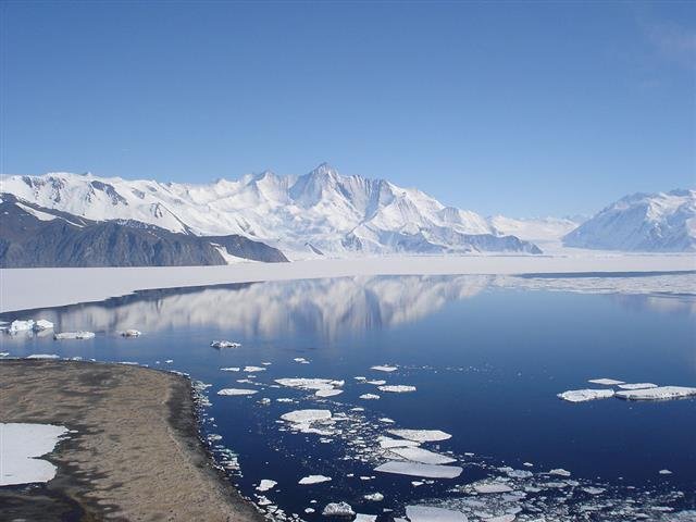
Figure 1. In theory, if a large mass of glaciers or ice sheets melted, this could cause a global sea level rise. Similarly, if glaciers or ice sheets expanded, this could cause a global sea level fall. Photo of Antarctica's Mt. Herschel by Andrew Mandemaker, taken from Wikimedia Commons. Click to enlarge.
Other researchers, such as Dr. James Hansen of NASA GISS, have hypothesised that man-made global warming will be so strong that it could cause the large ice sheets on Greenland, East Antarctica or West Antarctica to suddenly melt, leading to sudden and dramatic sea level rises of several metres, e.g., Hansen, 2005 (Abstract; .pdf available on NASA GISS website). Hansen and others have been promoting these scary scenarios since the early 1980s (e.g., see this New York Times article from August, 1981), and it is from such sources that the Hollywood stories seem to originate (e.g., Hansen was the main scientific advisor for Al Gore’s An Inconvenient Truth film and book).
So, are these scary model predictions reliable, and should we be worried?
Well, in this post, we will forget about the models, and look at what the actual data says. We will find that the data suggests that at most sea levels have risen by 15-20cm since the end of the 19th century. That’s not particularly dramatic. But, if you believe in man-made global warming theory, then you might say “aha, that’s due to CO2, and it will get worse”.
However, the apparent sea level rise seems to have been relatively constant over the last century. If it was due to CO2, we would expect to see a dramatic acceleration since the 1950s, as CO2 concentrations increased. Since this doesn’t seem to have occurred (despite some claims to the contrary – see Section 5), it suggests that the apparent sea level rise is a naturally-occurring phenomenon (perhaps due to natural global warming).
We will also find that there are a number of serious problems with the available sea level data. As a result, much (perhaps all) of the apparent sea level rise might be due to problems with the data. In other words, we do not actually know if there has been any significant sea level trends over the last century!
Astute readers will object and complain that there must have been some sea level trends over the last century. This is because, from the discussion above, we would expect to see sea level changes, since global temperatures do seem to have changed over the last century (whether the temperature trends are man-made or natural in origin). However, as we will discuss in the next section, this is not necessarily the case.
We might expect “global warming” (i.e., an increase in average surface air temperatures over a few decades) to lead to a rise in global mean sea levels. But, for the reasons we will discuss in Section 2, it is also theoretically possible that it could have no detectable net effect on global mean sea levels, or even lead to a net fall! Hence, when we look at the actual sea level records in Sections 3, 4 & 5, we should avoid biasing our analysis with our own views of what we think “should happen”:
“If a man will begin with certainties, he shall end in doubts. But, if he will be content to begin with doubts, he shall end in certainties” – Francis Bacon, Sr. (1561-1626)
2. Problems predicting global sea level changes
The density problem
The density of a liquid tells you the volume that a given mass of that liquid occupies. If the total mass of a liquid in a container (e.g., an ocean basin!) remains constant, but its density increases, then the volume of that liquid will decrease. Hence, the maximum height of the container that is reached by the liquid will decrease. In our case where the “container” is an ocean basin, this would mean a fall in the “global mean sea level”. Similarly, if the liquid density decreases, the maximum height reached will increase. This is the basis for the first theoretical prediction for the effects of global warming mentioned in Section 1 – if global warming causes the oceans to heat up, this should (in theory) cause sea levels to rise, from “thermal expansion”.

Figure 2. The anomolous expansion of liquid water with cooling at temperatures less than 4 °C, means that the bottom of a frozen garden pond can remain relatively warm, if it is deep enough. Schematic taken from Wikimedia Commons. Click to enlarge.
One problem with the thermal expansion theory is that the relationship between temperature and density is different for water than for most liquids. Like most liquids, when you cool pure liquid water from high temperatures, its density steadily decreases. However, unlike most liquids, water actually reaches its maximum liquid density several degrees above its freezing point, i.e., at 4°C instead of 0°C. Between 0°C and 4°C, water actually expands as it cools.
This is why ice (frozen water at 0°C or less) floats! It is also why fish that can survive at 4°C can overwinter in a garden pond that has ice on the top, by staying near the bottom of the pond (see Figure 2). This means that if global warming uniformly warmed up all of the oceans by 0.5°C (for example), some parts would certainly expand (water above 4°C), but other parts would actually contract (water above 0°C, but less than 4°C).
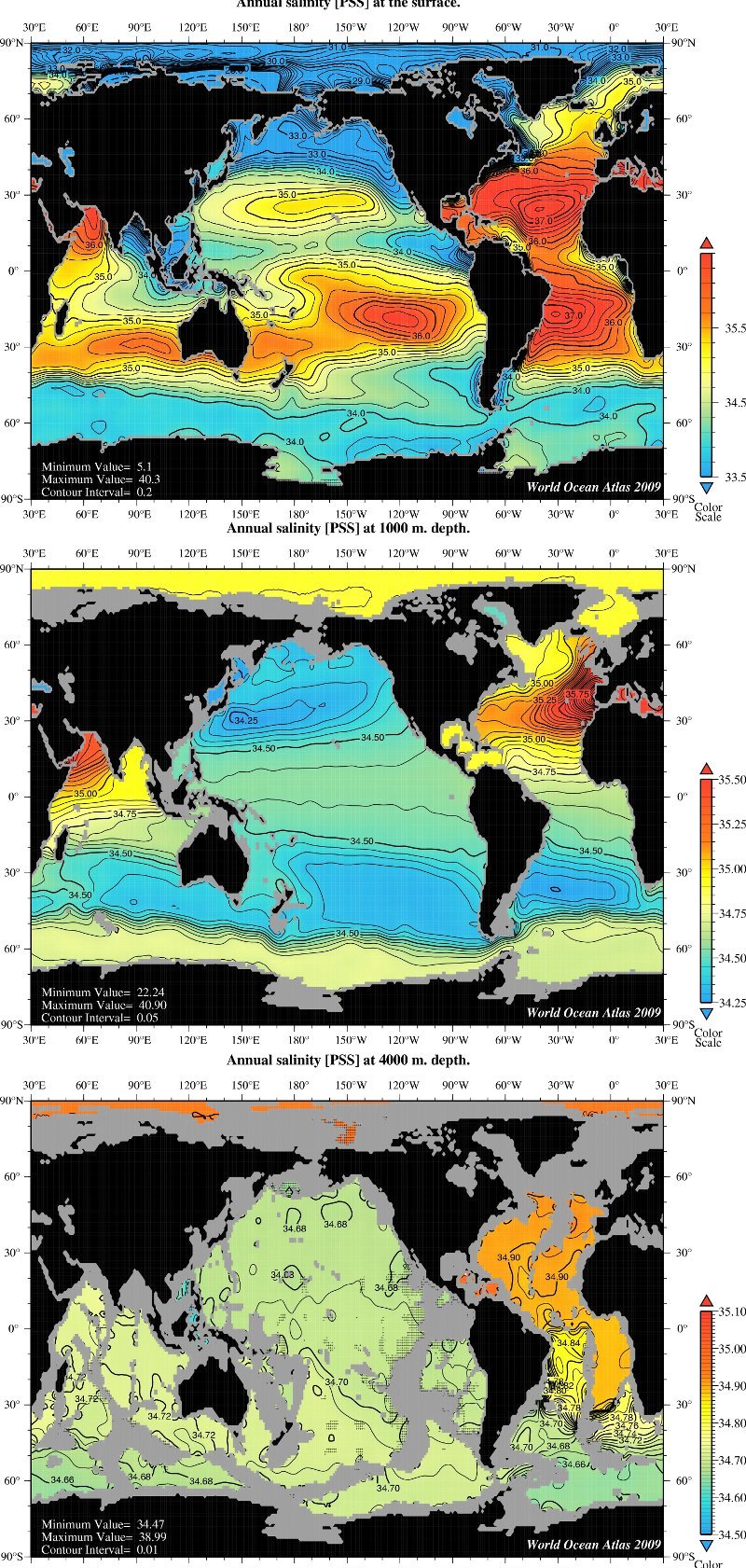
Figure 3. Maps of ocean salinity at different ocean depths - top: surface; middle: 1km deep; bottom: 4km deep. Note that the colour scales are different for each map. Also, some areas are grey in the lower maps, because the ocean floor is not that deep in those areas. Taken from NOAA NODC's World Ocean Atlas (2009). Click to enlarge.
Another problem is that the oceans are not pure freshwater. As anyone who has swam in the sea knows, seawater is salty. The amount of salt in seawater (known as its “salinity”) affects both its density and its freezing point.
Salty water freezes at lower temperatures than pure water – that’s why we grit roads with salt if we’re expecting icy conditions. Salty water is also more dense than pure water. For this reason, the density of seawater depends not only on its temperature, but also its salinity. As can be seen from the maps in Figure 3, the salinity of the oceans varies across the world, e.g., the Atlantic Oceans are slightly saltier than the Pacific Oceans. This regional variability also varies with depth.
Indeed, this complex dependence of ocean density on both temperature and salinity is believed to be one of the main drivers of the ocean circulation, as redistribution of more dense and less dense sea water leads to various different “thermohaline circulations” patterns. [The name “thermohaline” is derived from “thermo” for temperature and “haline” for salinity].
As a result, the effects of global warming or global cooling on ocean densities are complex, and still poorly understood. For instance, suppose the oceans were to uniformly heat up or cool down by 0.5°C (for instance). If that were to occur, then the density changes at a particular spot would depend on not just the temperature change, but also the absolute temperature and salinity at that spot. In reality, global warming or cooling (whether man-made or natural in origin) is unlikely to occur uniformly throughout the oceans, e.g., temperature changes usually vary with latitude and depth, and depend on ocean circulations.
Effects of human activity on water storage
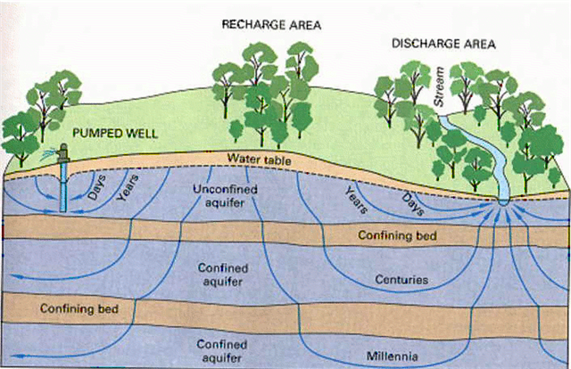
Figure 4. To meet water requirements for expanding populations, many groundwater pumps have taken to pumping water from further and further below ground. In some cases, they may be extracting water that has been underground for thousands of years. Schematic of water age taken from Wikimedia Commons. Click to enlarge.
Another complexity is that the actual amount of water involved in the “water cycle” may have changed over the years. Rapid expansion in groundwater exploitation (e.g., using well water) occurred during 1950–1975 in many industrialized nations and during 1970–1990 in most parts of the developing world – see Foster & Chilton, 2003 (Open access), for a discussion. After this groundwater has been extracted from the ground, it is used and recycled. Eventually, much of it will end up in the oceans. In this way, humans could be significantly raising sea levels by taking groundwater that had until recently been trapped underground, and putting it back into the water cycle.
If this phenomenon is significant, it would mean that the sea level rise which had been specifically attributed to global warming has been overestimated, e.g., see Sahagian et al., 1994(Abstract).
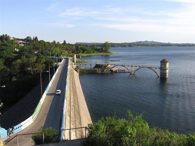
Figure 5. Have humans been reducing sea levels by building so many dams? Photo of the reservoir next to the city of Embalse, Córdoba, Argentina taken from Wikimedia Commons. Click to enlarge.
On the other hand, humans have also built a lot of dams to store water, particularly during the 20th century. Perhaps by doing so, we are reducing sea levels by preventing water from returning to the oceans. If this phenomenon is significant, then it would mean that the sea level rise which had been attributed to global warming may have been underestimated, e.g., see Gornitz et al., 1997 (Abstract; Google Scholar access).
Other types of human activity, such as deforestation/reforestation, could also be having significant effects on global sea levels (either increases or decreases). So, since the 1990s, a number of groups have tried to calculate these various contributions to changes in sea levels, although typically most studies have concentrated on just one contribution at a time.
The relative contributions of these different factors has been a subject of much debate, and seems to be ongoing. For example, studies such as Chao et al., 2008 (Abstract; Google Scholar access) claim human dam building has led to an underestimate of sea level rises due to global warming, while other studies, such as Wada et al., 2010 (Abstract; Google Scholar access) argue that ground water extraction has led to an overestimate of sea level rises due to global warming.
Effects of climate change on water storage
The above discussion of the effect of changes in water storage on land from human activity on global sea-levels, should not be confused with possible changes in water storage on land from climate change (whether man-made or natural).
Climate change could involve changes in the water cycle, thereby altering how much and how long water stays on land instead of in the sea, i.e., the amount of ground water and soil water. It could also affect the amount of snowfall. In addition, global warming or cooling (the most commonly thought of examples of climate change) could decrease or increase the length of time snow remains un-melted (and thereby keeping water “trapped” on land).
These climate-related land storage effects could be significant for global sea-levels, though unfortunately there seem to be very few direct experimental measurements of the factors involved, and so the only studies of these effects seem to have been from computer modelling of data from weather data “reanalysis” models (e.g., ERA-40).
These studies often yield contradictory results. For instance, Milly et al., 2003 (Open access) used computer simulations and results from the CMAP reanalysis of precipitation levels to calculate that climate-related changes in water storage on land were causing a sea-level rise of about 0.12 mm/year in the period 1981-1998 (although, they admitted they couldn’t calculate an error bar for that estimate). But, Ngo-Duc et al., 2005 (Abstract; Google Scholar access) obtained a much smaller value of 0.08 mm/year for the same period. They also found that if they looked over the longer period of 1948-2000, there was no significant trend in sea-level rise or fall, and that the 0.08 mm/year sea-level rise they calculated in the period 1981-1998 was probably due to natural variability.
What else?
In this section, we discussed several mechanisms whereby the expected sea level rises (or falls) from global warming (or cooling) might not actually occur. There may be other mechanisms which we haven’t mentioned, too. For instance, if global warming were to increase the volume of water in the oceans by causing glaciers or other ice bodies to melt, this would cause the weight of water in the oceans to increase. But, in doing so, this could in turn cause the ocean floors to sink, and thereby slightly reduce the expected sea level rise.
Before considering all the complexities mentioned above, it might have seemed a relatively easy problem to calculate how much sea level rise (or fall) to expect for a given global warming (or cooling) of, e.g., 0.5°C. This seems to be the popular assumption, even amongst climate scientists. But, in reality, it is a very complex problem. Readers should remember the American satirist, H. L. Mencken (1880-1956), who observed that:
There is always an easy solution to every human problem – neat, plausible, and wrong. - Henry Louis Mencken, 1917
We appreciate that many people like to have an easy answer to what they consider a simple question. But, unfortunately, if a simple answer is too simplistic, it is often wrong. With this in mind, rather than trying to make simplistic models to understand sea level changes, perhaps a better approach is to look at what the experimental data actually says. This is what we will attempt to do in the next sections.


")