• NEW! LOWEST RATES EVER -- SUPPORT THE SHOW AND ENJOY THE VERY BEST PREMIUM PARACAST EXPERIENCE! Welcome to The Paracast+, eight years young! For a low subscription fee, you can download the ad-free version of The Paracast and the exclusive, member-only, After The Paracast bonus podcast, featuring color commentary, exclusive interviews, the continuation of interviews that began on the main episode of The Paracast. We also offer lifetime memberships! Flash! Take advantage of our lowest rates ever! Act now! It's easier than ever to susbcribe! You can sign up right here!

    Subscribe to The Paracast Newsletter!

New Logo?

Free episodes:

New paracast logo

The design is retro cool--I like it (but) but I'm not convinced... I do love the retro font and headphones and the alien head shape, but I'd like to see an animated glyph where the alien eyes blink and all of a sudden it's a pair of human eyes, then, the human eyes blink and it's back to ET. PAUSE
Static archetypal almond-eyes--stylized or otherwise represents the antithesis of everything I intuit is going on--so, yeah its cool but this is the Paracast!

That's an interesting idea that would probably give me nightmares.
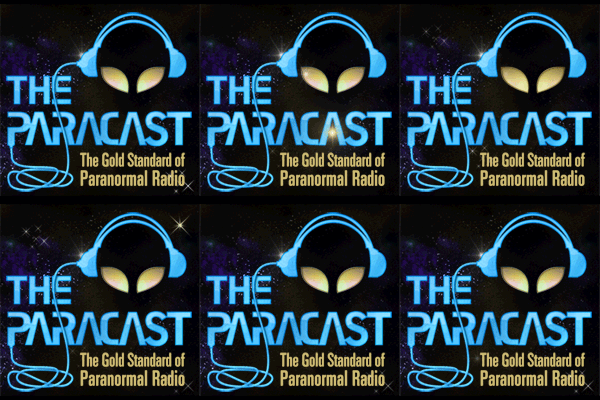
 
i like it too but the latest addition of the star field to the right of the logo is not well placed and doesnt tie into the logo very well.
 
I'm really pleased at the reception. We are also considering some redesign for our main sites, and we welcome advice, counsel, and maybe a few volunteers. :)
 
Back
Top